Nick Desbarats
Author, Consultant & Educator
Practical Reporting, Inc.
As an independent educator and author, Nick Desbarats has taught data visualization and information dashboard design to thousands of professionals in over a dozen countries at organizations such as NASA, Bloomberg, Visa, The United Nations, Shopify, The Internal Revenue Service, The Central Bank of Tanzania, and many others.
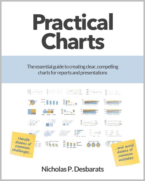
In this excerpt (Chapter 15 of his book Practical Charts) Nick discusses the variety of ways that we can make our charts more obvious to audiences, increasing the likelihood that our findings are understood.
Nick discusses the following six ways.
1. Explicitly stating insights in chart callouts and titles
2. Making design choices that feature the specific insight(s) to be communicated
3. Visually highlighting the most important part(s) of a chart
4. Adding comparison values
5. Adding red/green (or orange/blue)
6. Showing calculated values instead of raw value
Excerpted from Practical Charts by Nicholas P. Desbarats. Copyright © 2023.
Submit form below to download.
