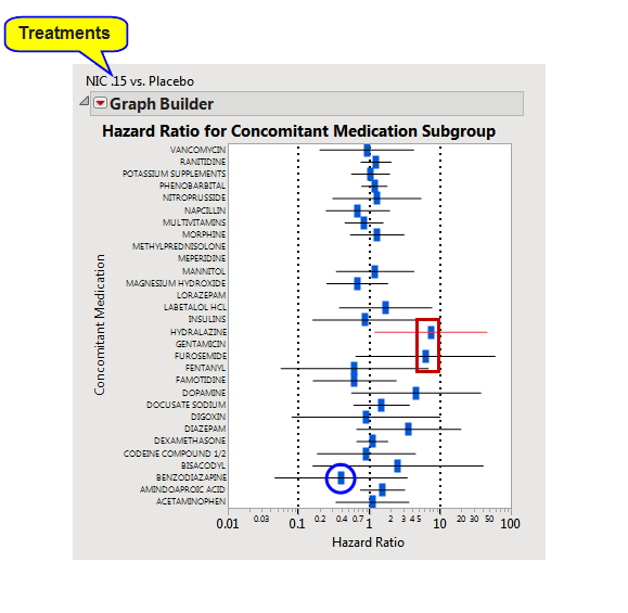
Hazard Ratio Event Plot
A hazard ratio event plot displays the relative disadvantages between two different treatment regimes on the survival of subjects in a study.
Note: Often, in smaller studies or studies that have multiple treatment groups with a small number of subjects per group, estimation of hazard ratios may not be possible or may lead to missing results. Hazard ratios are more reliable and useful when a study is appropriately sized for making such statistical comparisons.

Each bar represents the hazard rate posed by one treatment divided by the hazard rate caused by the second treatment. In plot shown above, patients were treated with either nicardipine (Treatment 1) or a placebo (Treatment 2) and plotted based on the concomitant medications patient were also taking.
Each blue rectangle represents the overall ratio for all patients taking the concomitant medication. Horizontal bars represent the 95% confidence interval. The ratios are plotted on a log-scale; a ratio1 is equivalent to no difference in hazard rates between the two treatments. Ratios greater than one (examples enclosed in a red box) show increased hazard rates resulting from treatment 1, whereas ratios less than one show increased hazard rates resulting from treatment 2.
Note: For Mortality Time to Event, hazard ratios reflect comparisons between/among subjects that died only. Because of this, you can see hazard plots for gender or race or concomitant medications with missing plot points instead of having all possible values.