Shift Plot
A shift plot enables you to compare how an experimental population responds to an experimental treatment.
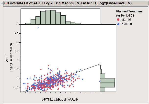
In the example plot shown here, individuals treated with either nicardipine (red) or a placebo (blue) were assayed for APTT activity before (baseline) and after treatment. Baseline measurements are plotted along the X axis and post-treatment measurements are plotted among the Y axis. Each point represents one patient. A diagonal line indicates no difference between the baseline and post-treatment values. The distributions indicate the variability in the baseline (top) and post-treatment (right) measurements.

Examination of the plot shown above indicates much variability in baseline measurements. This variability is reduced following treatment with either nicardipine or the placebo. Patients above the line show increased APTT levels and patients below the line show a reduction. The points tend to cluster along the line, indicating that neither treatment changed APTT levels very much.