Survival Curves

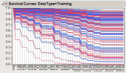
The survival curves shown above plot the survival functions estimated for each patient. Each curve represents one patient and is colored according to range. The curve plots the probability of survival on the Y axis and time on the X axis. Curves near the upper right of the plot indicate high survival probability and those near the lower left indicate low survival probability.