Analyze Patterns and Relationships in the Multivariate Platform
In the cereal example, you have identified which cereals to eat or avoid as part of a healthy diet. Now you want to see how the cereal variables relate to each other. The Multivariate platform enables you to observe patterns and relationships between variables. From the Multivariate report, you can do the following:
• summarize the strength of the linear relationships between each pair of response variables using the Correlations table
• identify dependencies, outliers, and clusters using the Scatterplot Matrix
• use other techniques to examine multiple variables, such as partial, inverse, and pairwise correlations, covariance matrices, and principal components
Note: For more information about the Multivariate platform, see Correlations and Multivariate Techniques in Multivariate Methods.
Scenario
You want to see the relationships between variables such as fat and calories. Analyzing the cereal data in the Multivariate platform reveals answers to the following questions:
• Which pairs of variables are highly correlated?
• Which pairs of variables are not correlated?
Create the Multivariate Report
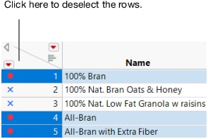
1. In the Cereal.jmp data table, click the bottom triangle at the top of the Columns panel to deselect the rows.
Figure 6.6 Deselecting Rows
2. Select Analyze > Multivariate Methods > Multivariate.
3. Select Calories through Potassium, click Y, Columns, and then click OK.
The Multivariate report appears. The report contains the Correlations report and Scatterplot Matrix by default. The Correlations report is a matrix of correlation coefficients that summarizes the strength of the linear relationships between each pair of response (Y) variables. The dark numbers indicate a lower degree of correlation.
Figure 6.7 Correlations Report
Note the following:
– In the Calories column, the number of calories is highly correlated with all variables except for sodium and fiber.
– In the Fiber column, fiber and potassium appear to be highly correlated.
– In the Sodium column, sodium is not highly correlated with the other variables.
The density ellipses in the Scatterplot Matrix further illustrates relationships between variables.
Figure 6.8 Portion of the Scatterplot Matrix
By default, a 95% bivariate normal density ellipse is in each scatterplot. Assuming that each pair of variables has a bivariate normal distribution, this ellipse encloses approximately 95% of the points. If the ellipse is fairly round and is not diagonally oriented, the variables are uncorrelated. If the ellipse is narrow and diagonally oriented, the variables are correlated.
Note the following:
– The ellipses are fairly round in the Sodium row. This shape indicates that Sodium is uncorrelated with other variables.
– The blue x markers, which represent Nat. Bran Oats & Honey, Cracklin’ Oat Bran, and Banana Nut Crunch, appear outside the ellipses in the Fat row. This placement indicates that the datum is an outlier (because of the amount of fat in the cereal).
You will further explore a scatterplot matrix later.
4. Click the Multivariate red triangle and select Pairwise Correlations to show the Pairwise Correlations report.
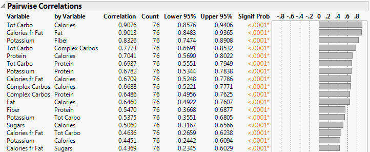
Figure 6.9 Portion of the Pairwise Correlations Report
The Pairwise Correlations report lists the Pearson product-moment correlations for each pair of Y variables. The report also shows significance probabilities and compares the correlations in a bar chart.
5. To quickly see which pairs are highly correlated, right-click in the report and select the Sort by Column, Signif Prob, Ascending check box, and then click OK.
The most highly correlated pairs appear at the top of the report. The small p-values for the pairs indicate evidence of correlation. The most significant correlation is between Tot Carbo (total carbohydrates) and Calories.
Figure 6.10 Small p-values for Pairs
Interpret the Results
Looking at the results, you can answer the following questions:
Which pairs of variables are highly correlated?
The Correlations report and Scatterplot Matrix show that the number of calories is highly correlated with all variables except for sodium and fiber. The Pairwise Correlations report shows that Tot Carbo (total carbohydrates) and Calories is the most correlated pair of variables.
Which pairs of variables are not correlated?
The Correlations report and Scatterplot Matrix show that Sodium is not correlated with the other variables.
Draw Conclusions
You confirm the previous decision to avoid the high fat 100% Nat. Bran Oats & Honey. Trying All-Bran with Extra Fiber and Fiber One was also a smart decision. These two high-fiber cereals have the added benefit of contributing a lower number of calories, fat, and sugars and a higher amount of potassium. You also decide to avoid high-carbohydrate cereals because they likely contain a large number of calories.


