Chart Options for Legacy Control Charts
The red triangle menu of chart options appears when you click the icon next to the chart name. Some options are also available under Chart Options when you right-click the chart. Not all of the options below are available for all control chart types.
Box Plots
Superimposes box plots on the subgroup means plotted in a Mean chart. The box plot shows the subgroup maximum, minimum, 75th percentile, 25th percentile, and median. Markers for subgroup means show unless you deselect the Show Points option. The control limits displayed apply only to the subgroup mean. The Box Plots option is available only for  charts. It is most appropriate for larger subgroup sample sizes (more than 10 samples in a subgroup).
Needle
Connects plotted points to the center line with a vertical line segment.
Connect Points
Shows or hides the line that connects the data points.
Show Points
Shows or hides the points representing summary statistics. Initially, the points show. You can use this option to suppress the markers denoting subgroup means when the Box Plots option is in effect.
Connect Color
Displays the JMP color palette for you to choose the color of the line segments used to connect points.
Center Line Color
Displays the JMP color palette for you to choose the color of the line segments used to draw the center line.
Limits Color
Displays the JMP color palette for you to choose the color of the line segments used in the upper and lower limits lines.
Line Width
Enables you to select the width of the control lines. Options are Thin, Medium, or Thick.
Point Marker
Enables you to select the marker used on the chart.
Show Center Line
Shows or hides the center line in the control chart.
Show Control Limits
Shows or hides the chart control limits and their legends.
Limits Precision
Sets the decimal limit for labels.
Tests
Shows a submenu that enables you to choose which tests to mark on the chart when the test is positive. Tests apply only for charts whose limits are 3σ limits. Tests 1 to 4 apply to Mean, Individual, and attribute charts. Tests 5 to 8 apply to Mean charts, Presummarize, and Individual Measurement charts only. If tests do not apply to a chart, the Tests option is dimmed. When sample sizes are unequal, the Test options are grayed out. If the samples change while the chart is open and they become equally sized, and the zone or test option is selected, the zones or tests are applied immediately and appear on the chart. These special tests are also referred to as the Western Electric Rules. For more information about special causes tests, see “Tests”.
Westgard Rules
Westgard rules are control rules that help you decide whether a process is in or out of control. The different tests are abbreviated with the decision rule for the particular test. See the text and chart in “Westgard Rules”.
Test Beyond Limits
Flags as a “*” any point that is beyond the limits. This test works on all charts with limits, regardless of the sample size being constant, and regardless of the size of k or the width of the limits. For example, if you had unequal sample sizes, and wanted to flag any points beyond the limits of an R chart, you could use this command.
Show Zones
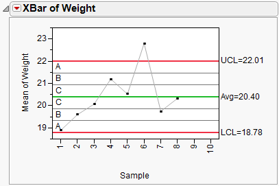
Shows or hides the zone lines. The zones are labeled A, B, and C as shown here in the Mean plot for weight in the Coating.jmp sample data. Control Chart tests use the zone lines as boundaries. The seven zone lines are set one sigma apart, centered on the center line.
Figure 14.14 Show Zones
Shade Zones
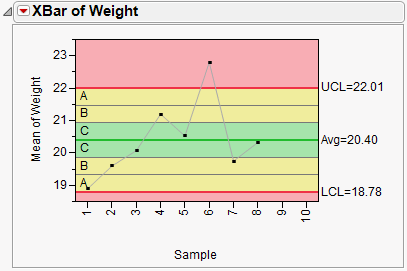
Shows or hides the default green, yellow, and red colors for the three zone areas and the area outside the zones. Green represents the area one sigma from the center line, yellow represents the area two and three sigmas from the center line, and red represents the area beyond three sigmas. Shades can be shown with or without the zone lines.
Tip: To change the colors used to shade the zones, right-click in the control chart and select Customize. In the Customize Graph window, you can specify colors for each of the three zones.
Figure 14.15 Shade Zones
OC Curve
(Available when subgroup sizes are equal.) Opens a new window that contains the operating characteristic (OC) curve, using all the calculated values directly from the active control chart. See Operating Characteristic Curves.

