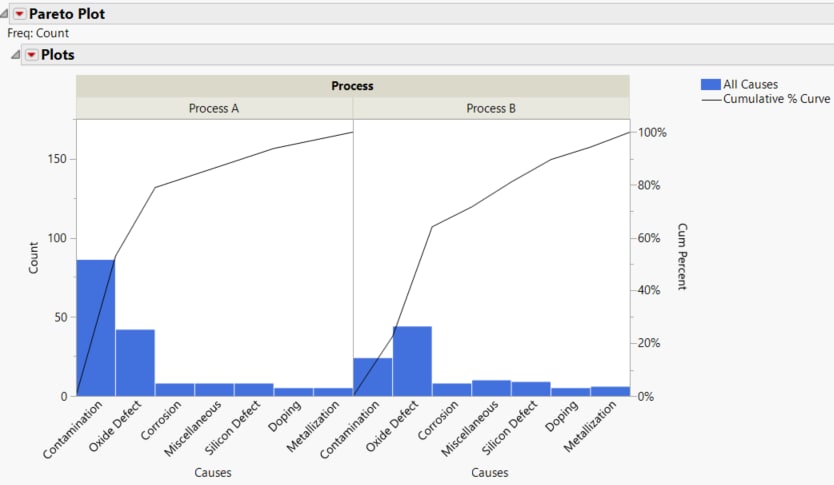
Example of a Non-Constant Sample Size across Groups
This example uses Pareto plots to compare the causes of failure during the fabrication of integrated circuits for two different processes. A unique sample size for each group is used by specifying size as the cause code, which designates the rows as size rows.The data table in this example lists the causes of failure the number of times each type of defect occurred.
1. Select Help > Sample Data Folder and open Quality Control/Failuressize.jmp.
2. Select Analyze > Quality and Process > Pareto Plot.
3. Select Causes and click Y, Cause.
4. Select Process and click X, Grouping.
5. Select Count and click Freq.
6. Select Per Unit Analysis and then select Value in Freq Column.
7. Enter size in Cause Code.
8. Click OK.
Figure 15.11 Pareto Plot Report Window
9. Click the Pareto Plot red triangle and select Per Unit Rates.
10. Click the Pareto Plot red triangle and select Test Rates Across Groups.
Figure 15.12 Per Unit Rates and Test Rates across Groups Results
Note that the sample size of 101 is used to calculate the DPU for the causes in group A. However, the sample size of 145 is used to calculate the DPU for the causes in group B.
If there are two group variables, Per Unit Rates lists DPU or rates for every combination of the grouping variables for each cause. However, Test Rate Across Groups only tests overall differences between groups.

