Example of an Overlaid Histogram and Ridgeline Chart
|
Data |
This example uses data from 442 diabetic patients. The data include baseline clinical and laboratory data as well as a binary measure of diabetes disease progression obtained one year after each patient’s initial visit. This measure classifies disease progression as Low or High. |
|
Techniques |
This example uses overlaid histograms and a ridgeline chart. |
|
Goal |
The goal of this example is to explore the distribution of a continuous variable grouped by categories. Specifically, you are interested in exploring how the distribution of HDL varies by gender and then by disease progression. |
1. Select Help > Sample Data Folder and open Diabetes.jmp.
2. Select Graph > Graph Builder.
3. Select HDL and drag it to the X zone.
4. Select Gender and drag it to the Overlay zone.
5. Click the Histogram element icon ![]() .
.
6. In the Histogram properties panel, from the Histogram Style list, select Kernel Density.
7. Hover over the Y axis near the top of the scale until the cursor turns into a horizontal hand. Click and drag until the maximum value is about 85.
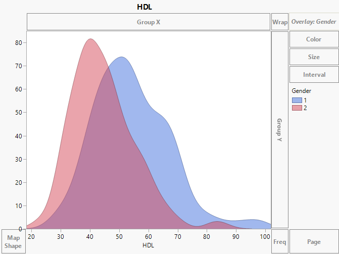
Figure 4.24 Overlaid HDL Histograms by Gender
The histograms indicate that HDL levels are higher in males (blue) than females (pink). The blue distribution falls to the right, or higher on the HDL scale, than the pink distribution. Now change the graph to view the differences in gender in a ridgeline plot.
8. Select Gender and drag it to the Y zone.
9. In the Histogram properties panel, move the Overlap slider to overlap the histograms (until the slider is about 3/4 up).
10. Click Done.
11. Double-click in the legend. In the Legend Settings window, double-click 1 and type male. Double-click 2 and type female.
12. Click OK.
Tip: If an item in the legend is still highlighted, click it to deselect it.
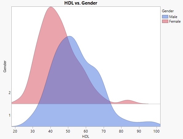
Figure 4.25 Ridgeline Chart of HDL by Gender and Diabetes Level
The ridgeline chart shows the gender distributions offsets.

