Example of an XBar and R Chart
In this example, you use the interactive workspace in Control Chart Builder to create an XBar and R Chart with a phase variable. Data on the diameter of medical tubing for a new prototype were collected over 40 days. After the first 20 days (phase 1), some adjustments were made to the manufacturing equipment. Analyze the data to determine whether the past 20 days (phase 2) of production are in a state of control.
1. Select Help > Sample Data Folder and open Quality Control/Diameter.jmp.
2. Select Analyze > Quality and Process > Control Chart Builder.
3. Drag DIAMETER to the Y role.
4. Drag DAY to the Subgroup role (at bottom).
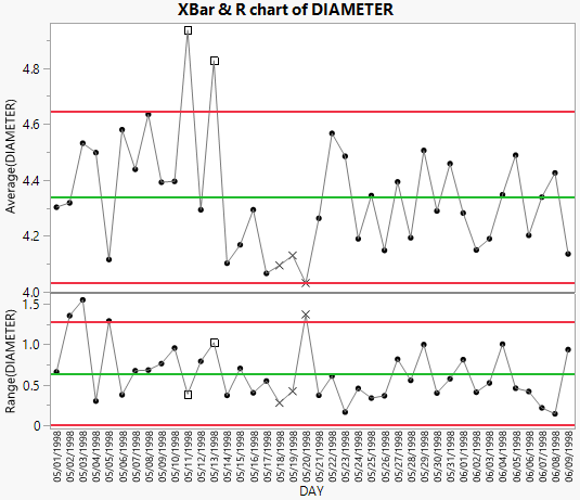
Figure 3.17 Control Charts for Diameter
The first 20 days appear to have high variability, and in the Average chart, there are three observations that are outside of the control limits. An adjustment was made to the manufacturing equipment and new control limits were incorporated.
To compute separate control limits for each phase:
5. Drag Phase to the Phase role.
6. In the Average chart, right-click and select Warnings > Test Beyond Limits.
7. In the Limits[1] outline, select Shade Zones.
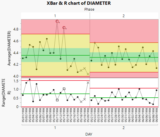
Figure 3.18 Control Charts for each Phase
Including the Phase variable means that the control limits for phase 2 are based only on the data for phase 2. None of the phase 2 observations are outside the control limits. This is highlighted by including the zone shading on the chart. Therefore, you can conclude that the process is in control after the adjustments were made.
Filter the Control Chart by Another Variable
This data table, Diameter.jmp, contains a column for the operator of the machine for each sample. You can use the Local Data Filter with Control Chart Builder to show the data for a subset of operators.
8. Click the Control Chart Builder red triangle and deselect Show Excluded Region.
Turning off the Show Excluded Region option indicates that the subgroups that are excluded by settings in the Local Data Filter no longer appear on the horizontal axis of the control chart as you make selections in the Local Data Filter. As a result, you see only the portion of the data that are of interest.
9. Click the Control Chart Builder red triangle and select Local Data Filter.
10. In the Local Data Filter, click on OPERATOR and click the + button.
11. In the Local Data Filter, select the bar labeled RMM.
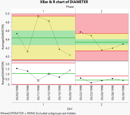
Figure 3.19 XBar and R Chart of Diameter for Operator RMM
The XBar and R charts now show only the points for the RMM operator, as denoted by the Where() statement below the charts. The limits for both phases have been adjusted to reflect that the observations for the other three operators have been excluded.


