Launch the Scatterplot 3D Platform
Launch the Scatterplot 3D platform by selecting Graph > Scatterplot 3D.
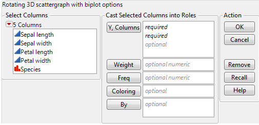
Figure 9.3 The Scatterplot 3D Launch Window
Y, Columns
Select the variables to plot on the 3D scatterplot. The order in which you select the variables determines where the data points appear on the axes:
– The first variable appears on the x axis.
– The second variable appears on the y axis.
– The third variable appears on the z axis.
You can assign the remaining variables interactively through the drop-down menus below the scatterplot.
Weight
Use the Weight variable to:
– Assign a weight (importance or influence) to the data
– Visualize a fourth variable that sizes the points
Note: Red triangle options account for the Weight variable. If you do not want this variable accounted for in your analyses, remove it from the launch window.
When you specify a Weight variable, JMP draws the points as balls. The balls are scaled so that their volume represents the weight value. You click and drag the Circle Size slider below the scatterplot to resize the balls.
Freq
Identifies the data table column whose variables assign a frequency to each row. This option is useful when a frequency is assigned to each row in summarized data.
Coloring
Colors the points according to the selected variable. If the selected variable is categorical (nominal or ordinal), each category is colored distinctly. If the selected variable is continuous, a gradient of colors is used.
By
Produces a separate 3D scatterplot for each By variable value. When two By variables are assigned, a separate graph is produced for each combination of both By variables.
After you click OK, the Scatterplot 3D report window appears.
