Additional Example of the EWMA Control Chart Platform
In this example, you create a chart that overlays the subgroup points and limits on the EWMA control chart. This enables you to see the EWMA points in the context of the subgroup points. The data table used in this example contains simulated observations of temperature at the time of magnet quench. Magnet quench occurs when part of the superconducting coil enters a resistive state and increases in temperature. When this happens, containment of the fusion reactor is at risk. Immediately shutting down power to the magnet is required to prevent a breach.
1. Select Help > Sample Data Folder and open Quality Control/Quench.jmp.
2. Select Analyze > Quality and Process > Control Chart > EWMA Control Chart.
3. Select Temp and click Y.
4. Select Time stamp and click Subgroup.
5. Click OK.
6. Click the EWMA Control Chart red triangle and select Test Beyond Limits.
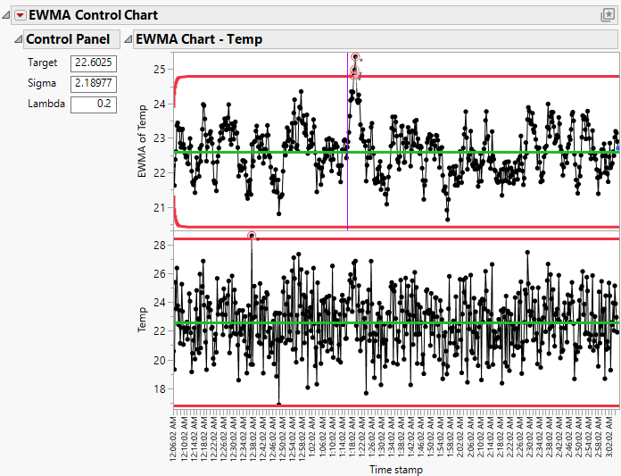
Figure 11.7 EWMA Chart with Points Beyond Limits Highlighted
Note that three observations are outside the limits in the EWMA chart and one observation is outside the limits in the X chart. The observations outside of the limits are indicated by a red circle. The purple vertical line in the EWMA chart denotes a shift upward around 1:16 AM.
7. Click the EWMA Control Chart red triangle and select Overlay Charts.
The X chart limits are not shown on the overlay chart by default, so the observation outside the X limits is not circled until you turn on the X limits for the overlay chart.
8. Click the EWMA Control Chart red triangle and select Show X Limits on Overlay Charts.
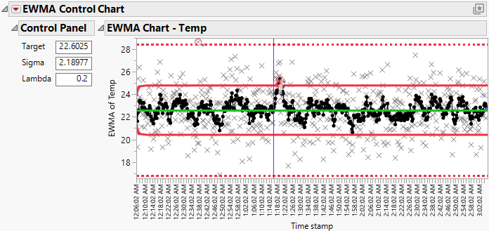
Figure 11.8 EWMA Chart with Overlaid X Chart
The solid lines and circles in the top chart represent the limits and points for the EWMA chart. The dashed lines and x markers represent the limits and points for the X chart. Note that the observations outside the EWMA limits and the X limits are still circled.
9. Click the EWMA Control Chart red triangle and select Constant Limits.
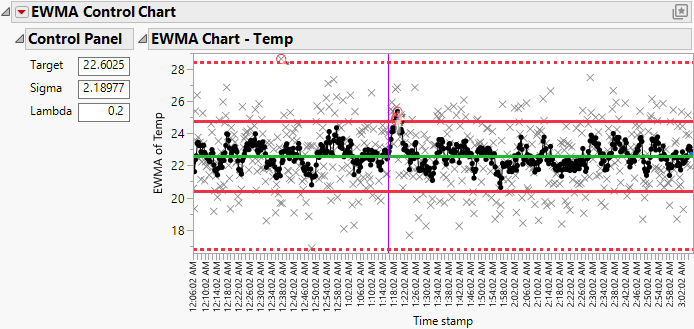
Figure 11.9 EWMA Chart with Constant Limits
Because the time span of the data is so long, the asymptotic limits differ from the original EWMA limits only for the first few subgroups. In this case, you might decide that you can use constant (asymptotic) limits instead of the EWMA limits.


