Create a Second Y Axis
If you have two or more Y variables on the same axis, you can reflect the scaling of a second set of variables by creating a second Y axis. This can be useful when two variables measure the same underlying quantities, but have different scales. In general, it is unwise to use a second Y axis in any other situation. See Few (2008).
To create a second Y axis, follow these steps:
1. Right-click one of the Y variable names in the Y zone and select Move Right.
2. Select the variable or variables that you want to move to the new axis.
The new axis is scaled according to the values of the specified variable, and the selected variable is plotted against this axis.
3. Repeat the process to plot additional variables against the new axis.
The new axis adjusts to accommodate the values of the additional variables.
Change the Graph for a Second Y Axis
When you click an element type, it applies only to the variables on the left Y axis. To apply an element to the variables on the right Y axis, right-click and change the second element, which corresponds to the right axis.
Example of Creating a Second Y Axis
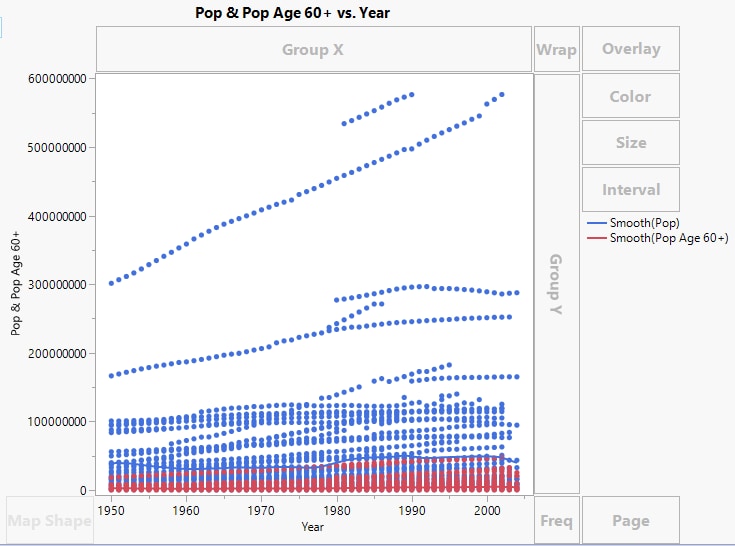
The PopAgeGroup.jmp sample data table contains world region populations by age and year. The Pop column contains country population by year and the Pop Age 60+ column contains the population 60 and older. You want to show these two variables on a single chart.
1. Select Help > Sample Data Folder and open PopAgeGroup.jmp.
2. Select Graph > Graph Builder.
3. Select Pop and PopAge 60+ and drag them to the Y zone.
4. Select Year and drag it to the X zone.
Figure 3.14 Pop and Pop Age 60+ Merged
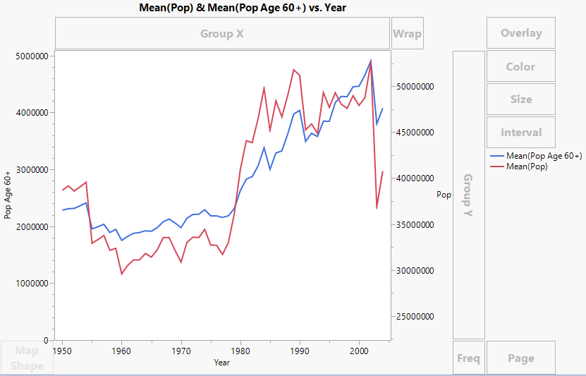
To make the Pop Age 60+ values more visible, calculate yearly means and then add a second Y axis.
5. In the Points options panel, set the Summary Statistic to Mean.
6. Click the Line element ![]() .
.
7. Right-click the variable names in the Y zone and select Move Right > Pop.
Figure 3.15 Second Y Axis Added
An axis for Pop is added on the right, and the axes rescale to show both sets of values. You can now see relationships between the two measures. For example, both measures began to decrease in 2002.
8. (Optional) Click Done.

