Example of a Butterfly Chart
|
Data |
This example uses summarized survey responses to 20 questions all using the same 5-point Likert scale. |
|
Techniques |
This example uses a bar chart with variable ordering and color customizations. |
|
Goal |
The goal of this example is to create a butterfly chart of the responses to 20 survey questions. This provides a summary visual of the results from a large number of survey questions in one chart. |
1. Select Help > Sample Data Folder and open Likert Survey.jmp.
Notice the following about this data:
– The data has a row for each question and columns with the counts of responders for each different response.
– The order of the survey questions in the question column is not sequential. When you use this column in Graph Builder, JMP orders the rows sequentially.
– Formula columns are included in the table to create negative counts for negative responses. The neutral counts are split so that half contribute to a negative column and half contribute to a positive column.
2. Select Graph > Graph Builder.
3. Select question and drag it to the Y zone.
4. Select agree, strongly agree, -strongly disagree, -disagree, -neutral, and +neutral and drag them to the X zone.
5. Click the Bar element ![]() .
.
6. In the Bar properties panel, do the following:
– Change the Bar Style to Stacked.
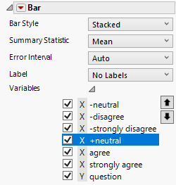
– Open Variables, and then highlight a variable and use the arrow icons to move them into this order, from top to bottom: -neutral, -disagree, -strongly disagree, +neutral, agree, strongly agree.
Figure 4.14 Completed Bar Properties Panel
7. Click the Graph Builder red triangle and select Legend Position > Bottom.
8. Click Done.
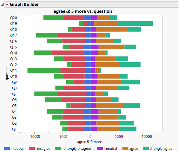
Figure 4.15 Graph Prior to Legend Customizations
Customize the Legend Colors and Ordering
1. Right-click on each color in the legend and change the Fill Color:
– Light gray for +neutral and -neutral
– Light pink for -disagree
– Red for -strongly disagree
– Light green for agree
– Dark green for strongly agree
2. Hover over any item in the legend. The cursor should appear as a hand. Double-click to open the Legend Settings window.
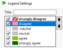
3. Highlight a variable and use the arrow icons to change the order from top to bottom: -strongly disagree, -disagree, -neutral, +neutral, agree, strongly agree.
4. Double-click +neutral and rename it to neutral.
5. Deselect the box next to -neutral so that it no longer appears in the legend, because it is a duplicate.
6. Double-click -strongly disagree and -disagree and remove the - sign.
Figure 4.16 Completed Legend Settings
7. Click OK.
8. Change the titles of the X axis and graph:
a. Click the graph title and enter Agreement vs. Question.
b. Click the X-axis title and enter agreement.
9. Double-click in the Y axis and select the Reverse Order box, and then click OK.
10. Double-click in the X axis and select the Major Grid Lines box, and then click OK.
The grid lines help you visually judge the differences between question results.
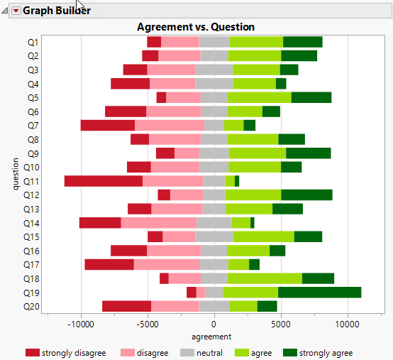
Figure 4.17 Final Likert Scale Graph
Tip: If an item in the legend is still highlighted, click it to deselect it.
This graph provides a visual summary of 20 survey questions, ignoring the non-responses. Note that the non-responses are less than 1% of the total responders for any question. Therefore, leaving them out of the visualization does not impact the conclusions. Question 19 has the most positive responses, and Question 11 has the least favorable responses.


