Example of Model Driven Multivariate Control Charts
In this example, you build a multivariate control chart for the historical values of six process variables in a steam turbine system.
1. Select Help > Sample Data Folder and open Quality Control/Steam Turbine Historical.jmp.
2. Select Analyze > Quality and Process > Model Driven Multivariate Control Chart.
3. Select all six columns, click Process, and click OK.
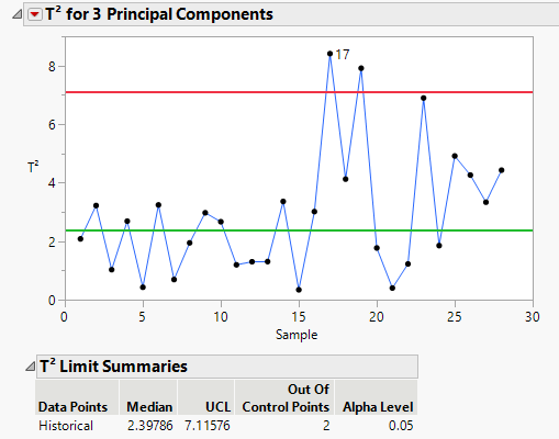
Figure 13.2 Steam Turbine Report
Note that the process shifts after sample 16.
4. Select the sample 17 data point. Right-click and select Rows > Row Label.
5. Hover over the sample 17 data point to view the T2 contribution proportion plot for that point. Click on the plot to open the plot in the report window.
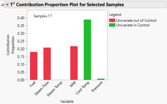
Figure 13.3 Contribution Proportion Plot for Sample 17
Note that Cool Temp contributes 40% of the T2 value. The Cool Temp bar is green indicating that sample 17 is within the univariate control limits for Cool Temp. Steam Flow and MW each contribute about 20% of the T2 value. They are both red, which indicates that sample 17 is outside of the univariate control limits for each variable. Steam Temp has a zero contribution to the T2 value. In this example, you found variables where the multivariate out-of-control sample could be traced to an out-of-control univariate variable. However, that is not always the case. In multivariate process control, you might observe an out-of-control point on the T2 chart but find that the sample is in-control at the univariate level for all variables.
6. Hover over the Steam Flow bar in the contribution proportion plot to see a univariate control chart for Steam Flow. Click on the chart to open in a new report window.
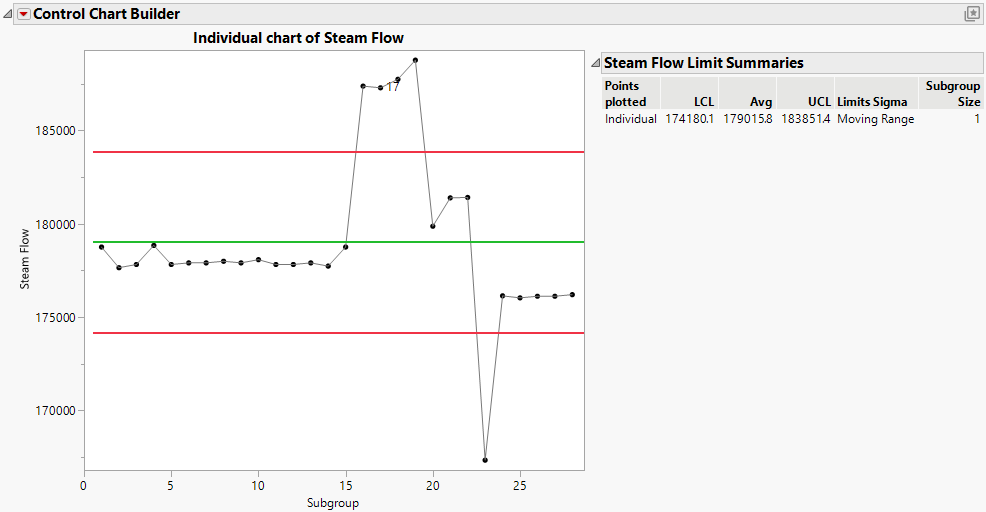
Figure 13.4 Individual Chart for Steam Flow
The individual chart indicates that the steam flow might have experienced an upset around sample 17. When control limits are specified in the Controls Limits column property, the individual chart respects those limits.
7. In the PCA Model Driven Multivariate Control Chart report window, Click the T2 for 3 Principal Components red triangle and select Contribution Proportion Heat Map.
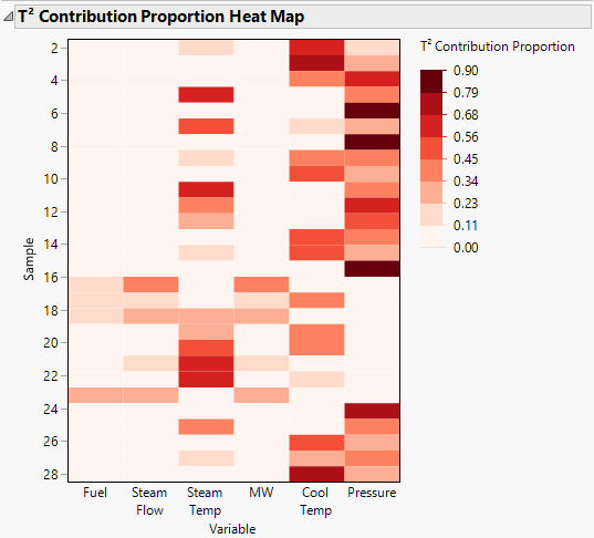
Figure 13.5 Contribution Proportion Heat Map
The contribution proportion heat map shows that there is a shift in the contribution proportions for rows 16, 17, and 18 and again at row 23 as compared to other rows. Generally, Steam Temp, Cool Temp, and Pressure contribute the most to the T2 value for each row.


