Points
In Graph Builder, the Points element ![]() shows data values as points.
shows data values as points.
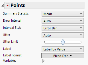
Figure 3.25 Points Options
Summary Statistic
Changes the statistic being plotted. The statistic is calculated using the variable on the Response Axis. None is the default setting, indicating that the data values themselves are plotted.
Error Interval
Adds or removes specified error interval in the graph.
Interval Style
Draws error bars, error bands, or hash bands for the selected error interval.
Jitter
Jitter adds random noise to values to reduce over-plotting. Choose from the following types of jitter:
None
No adjustments are made.
Auto
Adds various types of jitter when categorical variables are involved. No jitter is added when you have only continuous variables.
Random Uniform
Random offset with uniform distribution.
Random Normal
Random offset with Gaussian distribution.
Packed
Places markers tightly to preserve any non-jittered dimensions.
Centered Grid
Similar to Packed, but adjusts the non-jittered dimensions to fall into a grid.
Positive Grid
Similar to Centered Grid, but in the positive direction.
Density Random
For one-dimensional jitter, this option places markers randomly within the bounds of a violin plot. For two-dimensional jitter, this option places markers randomly within an oval.
You can also customize jitter by right-clicking and selecting Customize > Marker.
Tip: To create a dot plot, select the Positive Grid option. You can move the dot plot to start at the bottom by changing the Y-axis values to 0-1. You can also resize the markers to a larger value, such as 20, to adjust the binning of the dots.
Jitter Limit
Controls the spread or amount of overlap.
Label
The type of label to display.
Label Format
For labels that display a value, a variety of formats, including defining a custom format.
Variables
Shows or hides graph elements for variables, or re-orders the display of variables.
Note: These options do not apply to variables in the Group X, Group Y, Wrap, or Page zones.
Check boxes are followed by the zone designation and the name of the variable. Use check boxes to do the following:
– Show or hide the elements corresponding to a variable in a zone.
– Add or remove the effect of applying the Color, Size, Shape, or Freq variable to the variable in the zone.
Tip: If you have multiple graphs, you can color or size each graph by different variables. Drag a second variable to the Color or Size zone, and drop it in a corner. In the Variables option, select the specific color or size variable to apply to each graph.
Use arrows to re-order the display if there are multiple variables in a zone. Highlight a variable name and click an arrow to reposition it.
For an example using Variables, see “Example of an Area and Line Chart”.
Tip: To hide points with missing values for color or size, right-click on a points graph and choose Customize > Marker > Hide Missing Color or Hide Missing Size.
Red Triangle Options for Points
Response Axis
Changes the axis that is associated with the response variable to X (horizontal), Y (vertical), or automatically determines the response direction.
Set Shape Expression
Enables the use of a JSL expression to define a marker shape.
Set Shape Column
Sets a column to use as the marker shape.
