Example of a Color Map of Correlations of Effects
In this example, use the Color Map on Correlations to explore the relationships between factors in your design.
1. Select Help > Sample Data Folder and open Design Experiment/Bounce Data.jmp.
2. Select DOE > Design Diagnostics > Evaluate Design.
3. Select Silica, Sulfur, and Silane and click X, Factor.
You can also add Stretch as Y, Response. However, specifying the response has no effect on the properties of the design.
4. Click OK.
5. Click the gray disclosure icon to open the Color Map on Correlations section.
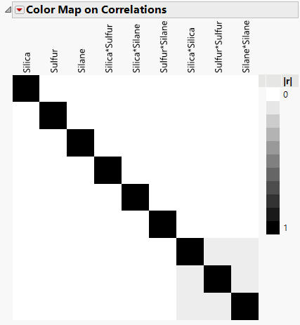
Figure 16.15 Color Map on Correlations
The black coloring indicates absolute correlations of one. Note that there are black cells on the diagonal, showing correlations of model terms with themselves. All other cells are either white or gray. The white cells indicate a correlation of zero. The gray cells correspond to correlations between quadratic terms. To see this, hover over each of the gray cell. The absolute correlations of quadratic terms with each other are small, 0.0714.
From the perspective of correlation, this is a good design. When effects are highly correlated, it is more difficult to determine which is responsible for an effect on the response.
