Example of a Laney P′ Chart
In this example, you compare a P control chart and a Laney P′ control chart using the Control Chart Builder. Laney P′ charts are useful when the variance in the data is greater than the variance that is assumed by the binomial distribution. The data are counts in milliliters of plastics measured from samples of ocean water that were taken over the course of 10 weeks in 3 different locations.
Create a Standard P Chart
1. Select Help > Sample Data Folder and open Quality Control/Water Plastics.jmp.
2. Select Analyze > Quality and Process > Control Chart > P Control Chart.
3. Select Total Plastic and click Y, n Defective.
4. Select Week and click Subgroup.
5. Select Total Volume and click n Trials.
6. Select Location and click Phase.
7. Click OK.
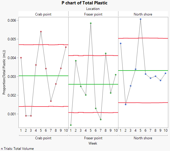
Figure 3.27 Standard P Chart for Water Plastics
There are several points on the standard P chart that are labeled as out of control. Due to how control limits are calculated in the standard P chart, there is a strong possibility that the out of control points are actually false alarms. Compare these results to the results from the Laney P′ chart.
Create Laney P′ Chart
8. Select Analyze > Quality and Process > Control Chart > Laney P′ Control Chart.
9. Select Total Plastic and click Y, n Defective.
10. Select Week and click Subgroup.
11. Select Total Volume and click n Trials.
12. Select Location and click Phase.
13. Click OK.
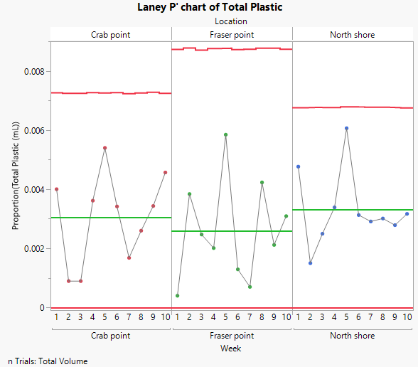
Figure 3.28 Laney P′ Chart for Water Plastics
Unlike the standard P chart, the Laney P′ chart displays all of the points as in control for this data set.

