Example of a Mixture Design with Analysis
Use the Mixture Design platform to create a mixture design for three chemicals and then analyze the results of the experiment. Three plasticizers (p1, p2, and p3) comprise 79.5% of the vinyl used for automobile seat covers (Cornell, 1990). Within this 79.5%, the individual plasticizers are restricted by the following constraints: 0.409 ≤ x1 ≤ 0.849, 0 ≤ x2 ≤ 0.252, and 0.151 ≤ x3 ≤ 0.274. Cornell uses a 14-run design to fit a quadratic mixture model to the collected responses. The design is a 3-degree extreme vertices design with replicate measurements taken at the four vertices and the overall centroid.
Create the Design
To create Cornell’s mixture design in JMP
1. Select Help > Sample Data Folder and open Plastifactors.jmp.
2. Select DOE > Classical > Mixture Design.
3. Click the Mixture Design red triangle and select Load Factors.
Figure 14.19 Factors and Factor Constraints for the Plasticizer Experiment
4. Click Continue.
5. Enter 3 in the Degree box.
6. Click Extreme Vertices.
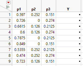
7. Click Make Table. JMP uses the 9 factor settings to generate a JMP table.
Figure 14.20 Extreme Vertices Mixture Design
Note: Your table might differ due to the random seed used to generate the design.
Next, you add an extra five design runs by duplicating the vertex points and overall centroid, to generate the 14 run design.
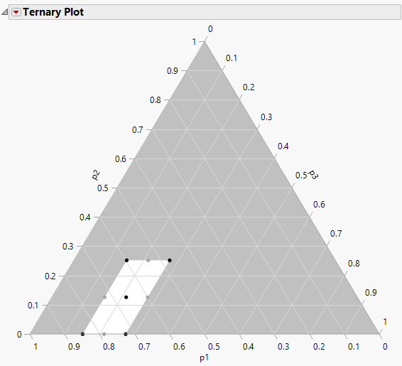
8. To identify the vertex points and the centroid use a ternary plot. From the design table, select Graph >Ternary Plot.
9. Select p1, p2, and p3 and click X, Plotting, and then click OK.
Figure 14.21 Ternary Plot for Design
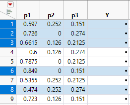
10. Highlight the vertices and centroid points.
Figure 14.22 Identify Vertices and Center Point
11. Select Edit > Copy, to copy the selected rows to the clipboard.
12. Click in the first cell of row 10 and select Edit > Paste to add the duplicate rows to the table.
Note: A similar design can be obtained using the Custom Design platform with the quadratic model, 2 center points, 4 replicate designs, and 14 runs.
The Plasticizer design with the results (Y values) that Cornell obtained are available in the sample data file Plasticizer.jmp.
Analyze the Mixture Model
To analyze the Plasticizer experiment use the sample data table Plasticizer.jmp.
1. Select Help > Sample Data Folder and open Plasticizer.jmp.
2. Click the green triangle next to the Model script in the upper left corner of the data table.
A completed Fit Model launch window appears.
Note: The model script is saved to the design table when you create a design.
3. Click Run to see the response surface analysis.
4. Plasticizer.jmp contains a column called Pred Formula Y. This column was added after the analysis by selecting Save Columns > Prediction Formula from the Response Y red triangle.
5. To see the prediction formula, click the plus symbol in the column list:
0–50.1465*p1 – 282.198*p2 – 911.648*p3 + p2*p1*317.363 + p3*p1*1464.330 + p3*p2*1846.218
Note: These results correct the coefficients reported in Cornell (1990).
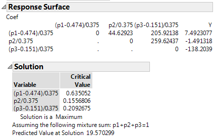
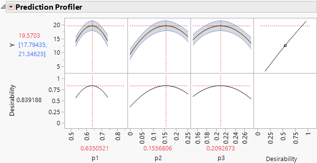
The Response Surface Solution report shows that a maximum predicted value of 19.570299 occurs at point (0.63505, 0.15568, 0.20927).
Figure 14.23 Mixture Response Surface Analysis
The Prediction Profiler
The report contains a prediction profiler.
1. From the prediction profiler, you can see how the crossed effects show as curvature in the prediction traces. As you change values of one component (drag the red lines) the values of the other two components move in the opposite direction to maintain their ratio and the overall mixture constraint (components must sum to 100%).
Note: The axes of prediction profiler traces range from the defined upper and lower bounds of the factors, p1, p2, and p3. When you explore the effect of a component and the limit of a second component is reached, it cannot move further and only the third variable changes to maintain the mixture constraint.
2. To the visible profile curves to bounds that take into account the levels of all three components, click the Prediction Profiler red triangle and select Profile at Boundary > Stop at Boundaries.
3. To optimize the mixture components click the Prediction Profiler red triangle and select Optimization and Desirability > Desirability Functions.
4. Click the Prediction Profiler red triangle and select Optimization and Desirability > Maximize Desirability to obtain the optimal factor settings for maximum Y.
The profiler displays optimal settings (rounded) of 0.6350 for p1, 0.1557 for p2, and 0.2093 for p3, which give an estimated response of 19.5703.
Figure 14.24 Maximum Desirability in Profiler for Mixture Analysis Example
The Mixture Profiler
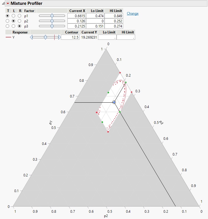
The Fit Model report also has a Mixture Profiler that is useful for visualizing and optimizing response surfaces from mixture experiments. Many of the features are the same as those of the Contour Profiler. However, some are unique to the Mixture Profiler:
• A ternary plot is used instead of a Cartesian plot, which enables you to view three mixture factors at a time.
• If you have more than three factors, radio buttons let you choose which factors to plot.
• If the factors have constraints, you can enter their low and high limits in the Lo Limit and Hi Limit columns. This setting shades non-feasible regions in the profiler.
Click the Response Y red triangle and elect Factor Profiling > Mixture Profiler to see the mixture profiler for the plasticizer data.
Figure 14.25 Mixture Profiler for Plasticizer Example

