Example of a Model Driven Multivariate Control Chart with a PLS Model
This example demonstrates the use of a PLS model for monitoring a multivariate process. Consider a process with 14 inputs and 5 quality variables. You have a PLS model that explains the process and you want to use this model to monitor the process for deviations.
1. Select Help > Sample Data Folder and open Polyethylene Process.jmp.
This data table contains 14 process variables and 5 quality or output variables. The first 100 rows are historical data used to build a PLS model to describe the process. These rows are colored blue. The remaining 239 rows are data collected since the model was built.
The partial least squares model finds 4 score functions that describe the process. These functions are saved to the data table in columns X Score 1 Formula to X Score 4 Formula. To build the PLS model, use the table script Set current data as excluded to exclude the 239 rows of data collected after the historical data. Then use the Fit Partial Least Squares table script to build the PLS model to relate the quality variable to the process variables.
2. Select Analyze > Quality and Process > Model Driven Multivariate Control Chart.
3. Select the X Score 1 Formula through X Score 4 Formula and click Process.
4. Set the Historical Data End at Row to 100.
5. Click OK.
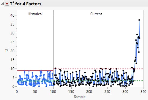
Figure 13.10 T2 Chart
The blue data points represent the historical data. The black data points are data points collected after the control chart was established. The process experienced an upset that begins around sample number 326.
6. Hover over the sample data points that are above the upper control limit to view contribution plots.
7. Select the first cluster of data points above the upper control limit. Click the T2 for 4 Factors red triangle and select Mean Contribution Proportion Plot for Selected Samples.
8. Click the red triangle next to T2 Mean Contribution Proportion Plot for Selected Samples and select Sort Bars.
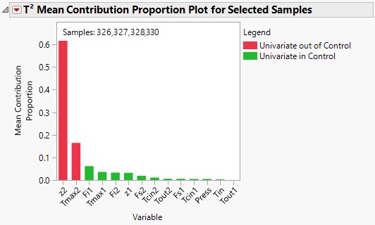
Figure 13.11 Mean Contribution Proportion Plot
Notice that the contributions plot is in terms of the PLS model input variables. It appears that z2 and Tmax2 are causing the process upset. Tmax2 and z2 are related. Tmax2 is a reactor temperature and z2 is the location of the Tmax2 temperature.
Note: The descriptions of the factors are recorded in the Notes column property.

