Example of the Multivariate Platform
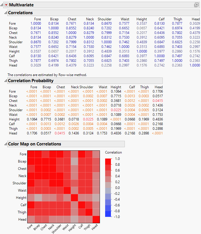
This example creates correlation matrices and a color map in the Multivariate platform to examine the relationship between different measurements on the body.
1. Select Help > Sample Data Folder and open Body Measurements.jmp.
2. Select Analyze > Multivariate Methods > Multivariate.
3. Select all columns except Mass and click Y, Columns.
4. Click OK.
The initial multivariate report contains a correlation matrix and scatterplot matrix. There is also a note that tells you that the Row-wise variance estimation method was used. All of the variables are positively correlated, but at varying strengths.
5. Click the Multivariate red triangle and deselect Scatterplot Matrix.
6. Click the Multivariate red triangle and select Correlation Probability.
7. Click the Multivariate red triangle and select Color Maps > Color Map on Correlations.
Figure 3.2 Multivariate Report for Body Measurements Data
The Color Map on Correlations report provides a more concise version of the information in the Correlation Matrix. The majority of the plot is dark red colors indicating that most of the variables are highly correlated. The two lighter colored rows and columns indicate that height and head measurements are not highly correlated with other variables. This is further supported by the mostly non-significant p-values for Height and Head in the Correlation Probability table.
