Example of the Time Series Platform
Use the Time Series platform to examine a series of maximum monthly temperatures and predict those temperatures for the next two years.
1. Select Help > Sample Data Folder and open Time Series/Raleigh Temps.jmp.
2. Select Analyze > Specialized Modeling > Time Series.
3. Select Temperature and click Y, Time Series.
4. Select Month/Year and click X, Time ID.
5. In the box next to Forecast Periods, type 24.
This is the number of future periods that are forecast by the models fit to the data. You want to predict the monthly temperature for the next two years, which is 24 months.
6. Click OK.
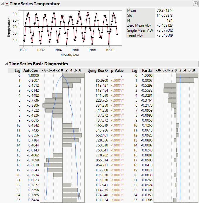
Figure 18.2 Time Series Analysis Report for Raleigh Temps.jmp
The Time Series graph shows that the series is cyclic. This cyclic component is also apparent in the autocorrelation chart. Points that are 1 lag apart are positively correlated, with an AutoCorr value of 0.8007. As points become farther apart, they become negatively correlated, then positively correlated again, and then the pattern repeats. The Time Series graph and the autocorrelation chart provide evidence of seasonality in the time series.
7. Click the Time Series red triangle and select ARIMA.
8. Set p, the autoregressive order, to 1 because the series showed evidence of autocorrelation.
9. Click Estimate.
10. Click the Time Series red triangle and select Seasonal ARIMA.
11. In the ARIMA box, set p, the autoregressive order, to 1 because the series showed evidence of autocorrelation.
12. In the Seasonal ARIMA box, set D, the seasonal differencing order, to 1 because the series showed evidence of seasonality.
13. Click Estimate.
14. In the Model Comparison table, check the box under Graph for both models.
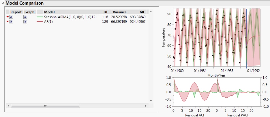
Figure 18.3 Model Comparison Table for Raleigh Temps.jmp
The Model Comparison table is sorted by the AIC statistic, in decreasing order. This means that the best fitting model appears at the top of the report. The AIC value for the seasonal ARIMA model (693.4) is much smaller than the value for the regular ARIMA model (924.5). The graph shows that while the ARIMA model predicts the observed points relatively well, the residuals are larger than those from the Seasonal ARIMA model. Also, the Seasonal ARIMA model has more realistic predictions for future observations with narrower prediction intervals. These results make sense since the series showed evidence of a seasonal component.

