 Example of the Uplift Platform
Examine the uplift in sales by analyzing the results from a marketing campaign designed to increase purchases of a hair coloring. For purposes of designing the study and tracking purchases, 126,184 “club card” members of a major beauty supply chain were identified. Approximately half of these members were randomly selected and sent a promotional offer for the product. Purchases of the product over a subsequent three-month period by all club card members were tracked.
The sample data table, Hair Care Product.jmp, contains a Promotion column that indicates whether the member received promotional material and a Purchase column that indicates whether the member purchased the product over the test period. For each member, Gender, Age, Hair Color (natural), U.S. Region, and Residence (whether the member is located in an urban area) was collected. Also shown is a Validation column consisting of about 33% of the subjects.
For a categorical response, the Uplift platform interprets the first level in its value ordering as the response of interest. The Purchase column has the Value Order column property to ensure that the “Yes” responses are first in the ordering.
1. Select Help > Sample Data Folder and open Hair Care Product.jmp.
2. Select Analyze > Consumer Research > Uplift.
3. From the Select Columns list:
– Select Promotion and click Treatment.
– Select Purchase and click Y, Response.
– Select Gender, Age, Hair Color, U.S. Region, and Residence, and click X, Factor.
– Select Validation and click Validation.
4. Click OK.
5. Below the Graph in the report that appears, click Go.
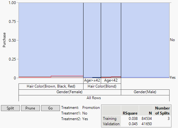
Based on the validation set, the optimal Number of Splits is determined to be three. Note that the left vertical scale is locked in order to maintain the overall rates of outcomes displayed on the right vertical axis.
Figure 6.2 Graph after Three Splits
The right hand vertical axis in the graph indicates that the proportion of purchases is small compared to non-purchases. The graph shows that uplift in purchases occurs for females with black, red, or brown hair and for younger females (Age < 42) with blond hair. For older blond-haired women (Age ≥ 42) and males, the promotion has a negative effect.
6. Click the Uplift Model for Purchase red triangle and select Uplift Graph.
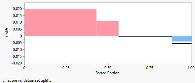
Figure 6.3 Uplift Graph
Notice that for two groups of subjects (males and non-blond women in the Age ≥ 42 group), the promotion has a negative effect. The horizontal lines shown on the Uplift Graph delineate the graph for the validation set. Specifically, the decision tree is evaluated for the validation set and the Uplift Graph is constructed from the estimated uplifts.

