Example of XBar and R Charts with Varying Subgroup Sizes
In this example, you use the interactive workspace in Control Chart Builder to create XBar and R charts using data that have varying subgroup sizes.
1. Select Help > Sample Data Folder and open Quality Control/Coating.jmp.
2. Select Analyze > Quality and Process > Control Chart Builder.
3. Drag Weight 2 to the Y role.
4. Drag Sample to the Subgroup role (at bottom).
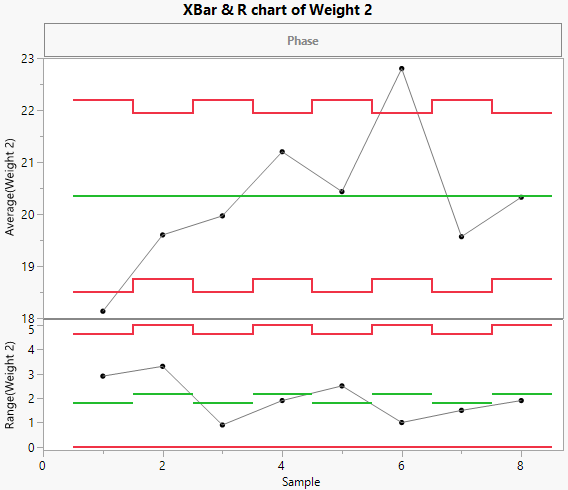
Figure 3.22 XBar and R Charts for Varying Subgroup Sizes
Weight 2 has several missing values in the data, so the chart has uneven limits. Although each sample has the same number of observations, samples 1, 3, 5, and 7 each have a missing value.
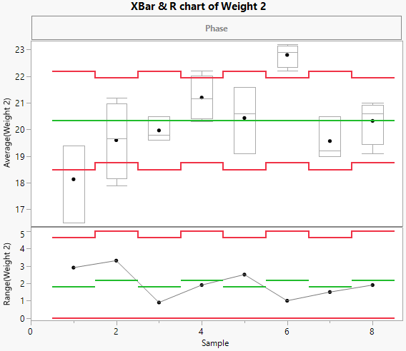
Instead of viewing a line connecting the averages of each sample, you can switch to viewing box plots at each sample.
5. In the Points[1] outline, deselect the Show Connect Line option.
6. In the Points[1] outline, select the Box Plots option.
Figure 3.23 XBar and R Chart with Box Plots

