Outlier Box Plot
Use the Outlier Box Plot option in the Distribution platform to see the distribution and identify possible outliers. Generally, box plots show selected quantiles of continuous distributions. The outlier box plot appears by default when there are fewer than 100,000 rows. You can set the value of this threshold using the Outlier Box Plot Row Cutoff platform preference under Preferences > Platforms > Distribution.
Note: Outlier box plots are also called Tukey outlier box plots or schematic box plots.
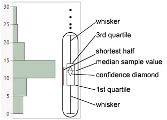
Figure 3.8 Outlier Box Plot
Note the following aspects about outlier box plots:
• The horizontal line within the box represents the median sample value.
• The confidence diamond contains the mean and the upper and lower 95% of the mean. If you drew a line through the middle of the diamond, you would have the mean. The top and bottom points of the diamond represent the upper and lower 95% of the mean.
• The ends of the box represent the 25th and 75th quantiles, also expressed as the 1st and 3rd quartile, respectively.
• The difference between the 1st and 3rd quartiles is called the interquartile range.
• The box has lines that extend from each end, sometimes called whiskers. The whiskers extend from the ends of the box to the outermost data point that falls within these distances:
1st quartile - 1.5*(interquartile range)
3rd quartile + 1.5*(interquartile range)
If the data points do not reach the computed ranges, then the whiskers are determined by the upper and lower data point values (not including outliers).
• The bracket outside of the box identifies the shortest half, which is the most dense 50% of the observations (Rousseeuw and Leroy 1987).
• To remove objects from outlier box plots, see Remove Objects from the Outlier or Quantile Box Plot.
