Mosaic Plot
A mosaic plot is a graphical representation of a two-way frequency table or contingency table. A mosaic plot is divided into colored rectangles, so that the area of each rectangle is proportional to the proportions of the Y variable in each level of the X variable.
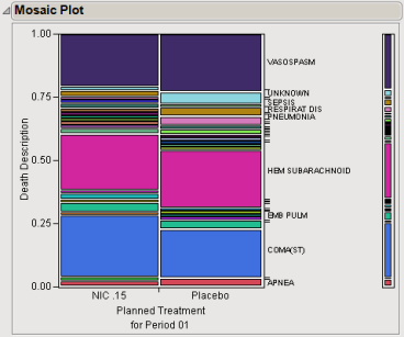
The plot shown below is generated from the nicardipine data included with JMP Clinical. It shows the cause of death in patients receiving either nicardipine (left) or the placebo (right).

The proportions on the x-axis represent the number of observations for each level of the X variable, which, for this example, is determined by the number of patients in each treatment arm. There are two columns because there were two treatment arms in this study.
The proportions on the y-axis at right represent the overall proportions of deaths that could be attributed to a specific adverse event.
The scale of the y-axis at left shows the response probability, with the whole axis being a probability of one (representing the total sample).
In this example, results are similar in patients receiving either nicardipine or the placebo. The results show that treatment with nicardipine had no significant influence on patient cause of death during this trial.
Note: Clicking on a rectangle in the mosaic plot highlights the rectangle and selects the corresponding rows in the associated data table