Volcano Plot
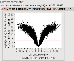
A volcano plot is useful for identifying events that differ significantly between two groups of experimental subjects. The name volcano plot comes from its resemblance to an idealized image of a pyroclastic eruption with the most significant points at the top as spewed pieces of molten lava. An example of a volcano plot derived using real data is shown below. The gene expression data used to generate this plot comes from two cell lines: one possessing five copies of the X chromosome (NA01416_5X, group 1) and one possessing one copy of the X chromosome (NA10851_1X, group 2). Group 2 is the control group.

Each point represents a gene. The differences between the groups are plotted on the x-axis. The log10(p-value) for the differences are plotted on the y-axis. The horizontal dashed line represents the significance cutoff specified in the analysis, usually derived using a multiple testing criterion.
For illustration purposes, the volcano plot shown above is divided into 4 quadrants, as shown below.

The vertical blue line passes through the zero point on the x-axis. Points lie on or close to this line when there is little or no difference between the groups for those observations. Points lying to the right of the vertical line (those in the red and blue quadrants) represent observations whose value is greater in group 1 than in group 2. Conversely, points lying to the left of the vertical line (those in the green and yellow quadrants) represent observations whose value is greater in group 2 than in group 1. Points lie above the dashed line (those in the green and red quadrants) when those differences are statistically significant.
Volcano plots like the one shown above are useful when there are many (thousands or even millions) observations with a wide range of differences, both positive and negative. It exhibits a densely populated, symmetrical “V” shape. When the number of observations is reduced or the variation in response is not so evenly distributed, the volcano plot might appear as shown below.

In this example, patients are treated either with nicardipine or with a placebo and assessed for adverse events. Events above the dotted line are considered significant at the selected multiple testing level. The most significant difference is observed for phlebitis, although many of the vascular events are significant. The events lying to the right of 0 (phlebitis, hypotension, isosthenuria) in the volcano plot are more severe in patients treated with nicardipine; those lying to the left (vasoconstriction, hypertension, and sinus bradycardia) are more severe in patients treated with the placebo.