Output Description
JMP Genomics Browser
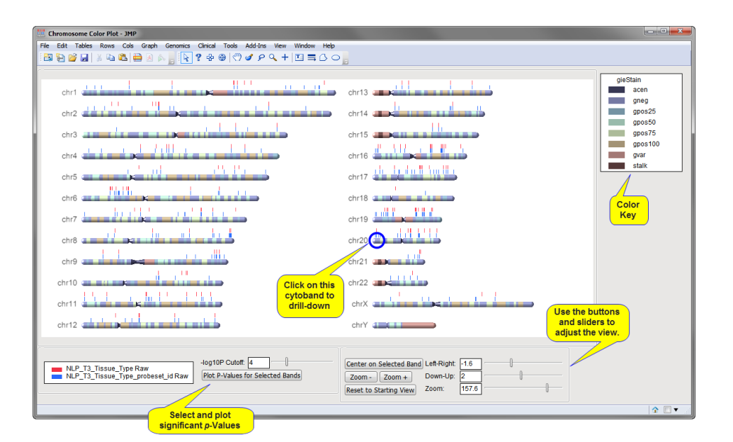
Running this process for the AffyHuEx1 sample setting generates the Chromosome Color Plot window (shown below) and three output data sets (not shown). Refer to the JMP Genomics Browser process description for more information.
Two output data sets list the names, chromosomal locations, and start and stop positions of individual cytobands and the stains used to color them. The third contains all of the columns from the input data set plus six additional columns that list the adjusted p-values and their significance.
The chromosome color plot, shown below, indicates the chromosomal locations of the transcript clusters, listed in the input data set, that have significant p-values for the given experimental conditions.

Each of the 24 human chromosomes (the X and Y chromosomes are considered separately) and associated cytobands are displayed in the chromosome color plot. You can use the sliders at the bottom right to move and resize features in the plot. The vertical bars listed above each chromosome show the location of transcript clusters with significant p-values. Each row of p-value bars corresponds to a different variable. The colors of the bars correspond to these variables (identified at the bottom left portion of the plot).
You can recursively explore regions of interest. For example, you can select a cytoband and:
| • | Click to adjust the display to a desired region. |
| • | Zoom in on the plot using the button. |

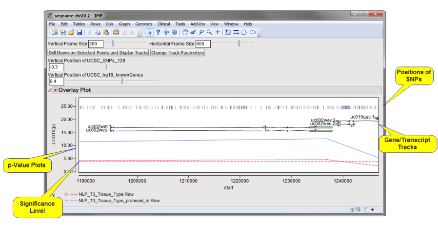
| • | Click to subset the output data set and generate an overlay plot (shown below) of the p-values for the clusters on the selected band. (Each point on the plot corresponds to a separate transcript cluster. The horizontal line in the plot represents the level of significance. Those points lying above this line correspond to the bars on the chromosome color plot.) |

| • | Use your mouse to highlight selected points in the overlay plot. Click in the box at the top of the overlay plot to generate both a subset data set (not shown) containing the selected observations and a tracks plot of the area about the selected points. The drill-down procedure generates several new data sets (not shown) containing the selected transcript clusters, as well as names and functional information for all of the genes and SNPs residing in the selected region. In addition, this information is presented along with p-values in a second overlay plot. |

| • | Observe the position of each gene, its exons, introns, and associated SNPs. |
| • | Adjust and resize the plot, select additional genes, and use the action buttons, as described above, to drill farther down into your data. |
| • | Connect to various online databases to gather additional information for your analysis. |