Heat Map Results
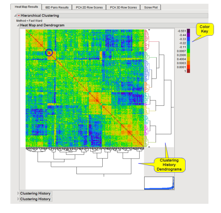
The Heat Map Results tab is shown below:

The Heat Map Results tab contains the following elements:
| • | One Heat Map and Dendrogram. |
The heat map and clustering results are useful to find and interpret patterns of relatedness across samples in the analysis. The output relationship matrix is a square symmetric matrix representing genetic relatedness of all possible pairs of samples computed using either the IBD, IBS, or AS metric. The heat map is a visual representation of computed genetic relationships where color represents the value of the computed relatedness metric for pairs of samples. The clustering dendrogram on the right side and bottom of the heat map show the clustering history of the samples. Samples that are grouped closely together indicate samples with similar patterns of relatedness.
The colors on the right dendrogram indicate either groups of samples as determined by the clustering algorithm or indicate categories or values of the (optional) Color Variable specified from the General tab on the dialog. In general, the “warmer” (more red) the color, the more closely related the individuals. The block circled in the heat map above is an example of one such closely related group. The adjacent”colder” (more blue) blocks represent less closely related samples.
Refer to the JMP Hierarchical Clustering documentation for more information.
The Results on this tab are linked to the Principal Components Analysis tabs (P-Value Plot Global, P-Value Plot Global) if they are shown. These tabs are interactive; you can select rows/samples using the dendrogram on this tab and see where those samples are in the PCA analysis and vice versa.