Example of a One-Way Comparative Pareto Plot
This example compares failures in samples of capacitors manufactured before and after cleaning a tube in the diffusion furnace.
1. Select Help > Sample Data Folder and open Quality Control/Failure2.jmp.
2. Select Analyze > Quality and Process > Pareto Plot.
3. Select failure and click Y, Cause.
4. Select clean and click X, Grouping.
The clean variable identifies samples as before and after cleaning.
5. Select N and click Freq.
6. Click OK.
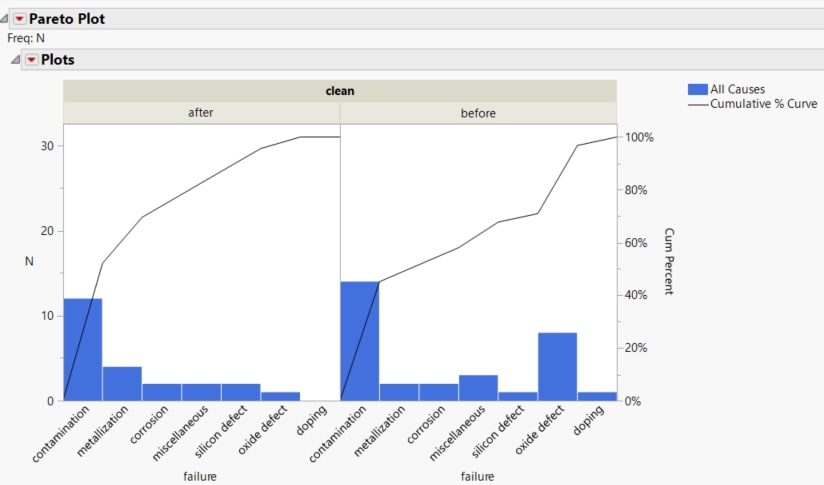
Figure 15.13 One-way Comparative Pareto Plot
There is a plot for each value of the variable clean. The horizontal and vertical axes are scaled identically for both plots. The bars in the first plot are in descending order of the Y axis values and determine the order for all cells.
7. Click the Plots red triangle and select Reorder Horizontal.
8. Click the down arrow once and then click OK.
This rearranges the order of the plots.
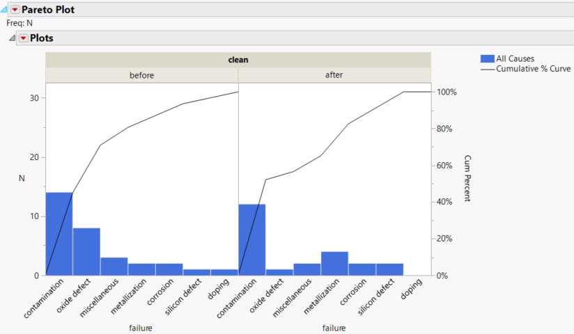
Figure 15.14 One-way Comparative Pareto Plot with Reordered Cells
The plots are easier to interpret when presented as the before-and-after plot shown in Figure 15.14. Note that the order of the causes changes to reflect the order based on the first cell. A comparison of these two plots shows a reduction in oxide defects after cleaning.

