Example of Adding a Background Map
This example uses data about hurricanes that affected the east coast of the United States. Adding a background map helps you see the affected areas. A script has been developed for this example and is part of the data table.
1. Select Help > Sample Data Folder and open Hurricanes.jmp.
2. In the Table panel, click the green triangle next to the Bubble Plot script.
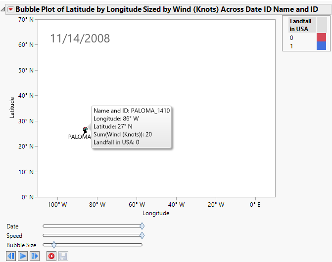
3. Drag the Date slider to the right as shown in Figure 12.26.
4. Click the red dot to display the name of the hurricane. The date appears in the upper left corner of the window. The red dot shows the location of Hurricane Paloma on November 14, 2008.
Figure 12.26 Bubble Plot of Hurricanes.jmp
Note that even though the location of the hurricane is plotted, it does not really tell us where it is. The axes information is there (27° North latitude and 86° West longitude), but we need a little more context. It is most likely over the middle of the Atlantic, but is it over a small island? This could make a big difference, especially for the inhabitants of the small island. Obviously, a map in the background of our graph would add a good deal of information.
5. Right-click the graph and select Background Map. The Set Background Map window appears (Figure 12.12).
6. Select Detailed Earth and click OK.
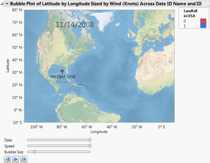
Figure 12.27 Bubble Plot of Hurricanes.jmp with Background Map
Now the coordinates make geographic sense. Click Run to view the animation of the hurricane data moving over the background map. Experiment with different options and view the displays. Adjust the axes or use the zoom tool to change what part of the world you are viewing. The map adjusts as the view does. You can also right-click the graph and select Size/Scale->Size to Isometric to get the aspect ratio of your graph to be proportional.
The next example uses the Katrina Data.jmp sample data table, which contains data on hurricane Katrina such as latitude, longitude, date, wind speed, pressure, and status. Adding a background map helps you see the path the hurricane took and impact on land based on size and strength. A script has been developed for this example and is part of the data table.
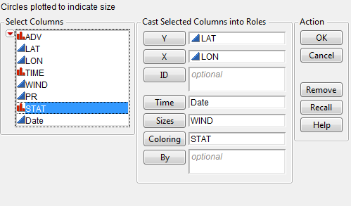
1. Select Help > Sample Data Folder and open Katrina Data.jmp.
2. Select Graph > Bubble Plot.
3. Select LAT and click Y.
4. Select LON and click X.
5. Select Date and click Time.
6. Select WIND and click Sizes.
7. Select Stat and click Coloring.
Figure 12.28 Bubble Plot Setup of Katrina Data.jmp
8. Click OK.
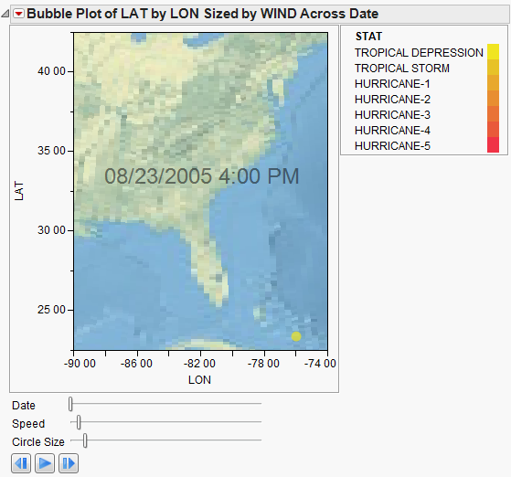
The following image appears. The yellow dot shows the location of Tropical Depression Katrina on August 23, 2005.
Figure 12.29 Bubble Plot of Katrina Data.jmp
Note that even though the location of the storm is plotted, it does not really tell us where it is. To add more context, add a map in the background.
9. Right-click the graph and select Background Map. The Set Background Map window appears.
10. Select Detailed Earth and click OK.
Figure 12.30 Bubble Plot of Katrina Data.jmp with Background Map
Now the coordinates make geographic sense. You can edit the axes and the size/scale to change how the graph appears.
11. Right-click the X axis (LON) and select Axis Settings. The X Axis Specification window appears.
12. Select Scale > Geodesic US.
13. Select Format > Geographic > Longitude DMM.
14. Click OK.
15. Repeat the same for the Y axis (LAT) except select Format > Geographic > Latitude DMM.
16. Right-click the map and select Size/Scale > Size to Isometric.
Figure 12.31 Bubble Plot of Katrina Data.jmp with Background Map
Click Run to view the animation of the hurricane data moving over the background map. You can manipulate the speed and the bubble size. Experiment with different options and view the displays. Adjust the axes or use the zoom tool to change what part of the area you are viewing. Add boundaries to the states. The map adjusts as the view does.


