Quantile Box Plot
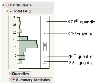
Use the Quantile Box Plot option in the Distribution platform to display specific quantiles from the Quantiles report. At a glance, you can see whether the distribution is symmetric. If the distribution is symmetric, the quantiles in the box plot are approximately equidistant from each other. For example, if the quantile marks are grouped closely at one end, but have greater spacing at the other end, the distribution is skewed toward the end with more spacing.
Figure 3.9 Quantile Box Plot
Quantiles are values where the pth quantile is larger than p% of the values. For example, 10% of the data lies below the 10th quantile, and 90% of the data lies below the 90th quantile.
Remove Objects from the Outlier or Quantile Box Plot
You can remove the confidence diamond and the shortest half from outlier or quantile box plots. You can remove them for a single graph, or remove them for all future graphs.
To remove them from an individual graph
1. Right-click the outlier box plot and select Customize.
2. Click Box Plot.
3. Deselect the check box next to Confidence Diamond or Shortest Half.
For more information about the Customize Graph window, see Customize Markers, Lines, Text, and More in Graphs in Using JMP.
To remove them for all future graphs
1. Select File > Preferences > Platforms > Distribution.
2. Deselect these options:
– Show Box Plot Confidence Diamond
– Show Outlier Box Plot Shortest Half
3. Click OK.
Any box plots you now add in Distribution will not have the confidence diamond or shortest half.
