Another Example of the Marker Relatedness Platform
Learn how to calculate relatedness in the interaction of the markers.
1. Select Help > Sample Data Folder > Life Sciences and open Genotypes Pedigree.jmp.
2. Select Analyze > Genetics > Marker Relatedness.
3. elect Markers (60/0) and click Marker.
4. Enter 2 for Ploidy.
5. Enter 12345 for Set Random Seed.
6. Set Kinship Type to Epistasis.
7. Specify Additive by Dominance for the Epistasis Type.
8. Specify Diploid Method 1 for the Additive Type.
9. Specify Diploid Method 1 for the Dominance Type.
10. Set Missing Marker Imputation Method to Random.
11. Leave both the Principal Components and Clustering boxes checked.
12. Click OK.
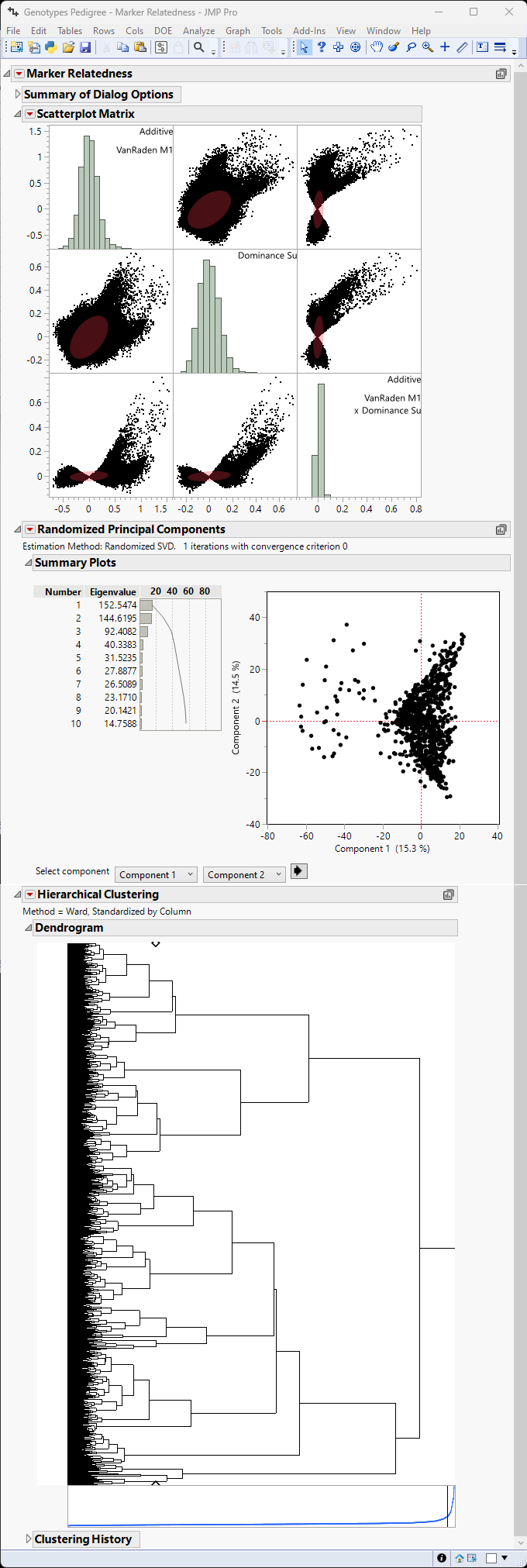
The Marker Relatedness report is generated as shown in Figure 5.4.
Figure 5.4 Example of the Marker Relatedness Platform
In this example, instead of a simple distribution, the scatterplot matrix shows a matrix plot of additive effects, dominance effects and the interaction of the two. The three distributions show the interaction of Additive effects with themselves (upper left), Dominance effects with themselves (center), and epistatic effects with themselves (lower right). The remaining blocks represent correlations between each pair of the three types of interactions. The absence of strong correlation among relatedness measures (additive, dominance, and epistasis) shows that each measure is capturing distinct information from the markers, which is desirable. Moreover, neither the principal components plot not the cluster analysis show strong evidence for relatedness.
