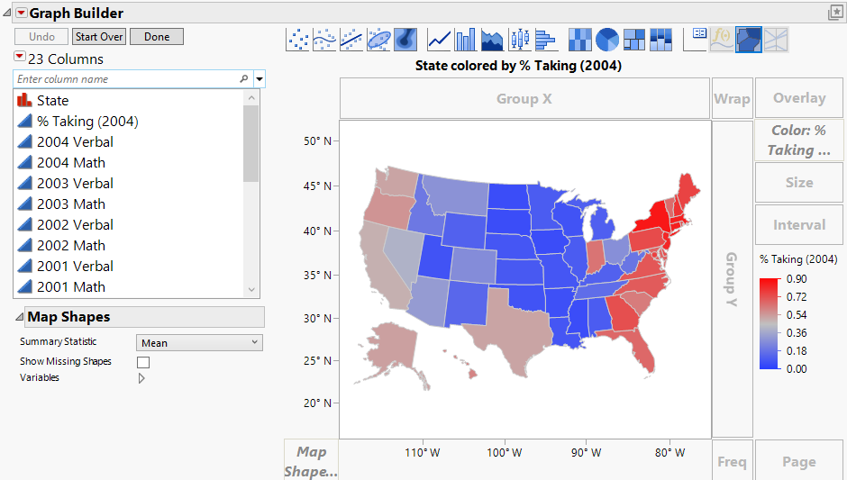
Example of Adding a Map to a Graph
This example uses data on the SAT standardized test for each US state.
1. Select Help > Sample Data Folder and open SAT.jmp.
2. Select Graph > Graph Builder.
3. Drag and drop State into the Map Shape zone.
4. Drag and drop %Taking (2004) into the Color zone.
Figure 12.2 Example of % Taking (2004) by State
Note the following:
• The latitude and longitude appear on the Y and X axes.
• The legend shows the colors that correspond to the percentage of students taking the SAT. Because %Taking (2004) is a continuous variable, the colors are based on a continuous color theme. Figure 12.2 uses the JMP default continuous theme. You can change the theme under File > Preferences > Graphs.
• The map is projected so that relative areas are not distorted (the 49th parallel across the top of the US is not a straight line).
