Example of an Ordered Bar Chart
|
Data |
This example uses data from college graduates in 2012. The table contains counts of degrees for graduates in 15 fields of study. Each degree is subdivided by the graduate’s job type. There are categorical columns for degree, degree type, and job type (where type is STEM or non-STEM related). The continuous column Number contains the number of graduates from each unique combination of degree and job type. Note: These data come from the U.S. Census Bureau (2012). |
|
Techniques |
This example uses color, a local data filter, and sorting options. |
|
Goal |
The goal of this example is to visualize the percentage of graduates who are employed in STEM-related jobs, based on their degree type. |
1. Select Help > Sample Data Folder and open STEM Jobs.jmp.
2. Select Graph > Graph Builder.
3. Select Degree and drag it to the X zone.
4. Select Percent and drag it to the Y zone.
5. Click the Bar element ![]() .
.
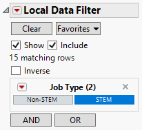
6. Click the Graph Builder red triangle and select Local Data Filter. In the Local Data Filter, perform these steps:
a. Click Job Type and then click ![]() .
.
b. Click STEM.
Note: The Show and Include options are selected by default in the Local Data Filter. To deselect these options, click the Local Data Filter red triangle and select Show Modes.
Figure 4.2 Selections in the Local Data Filter
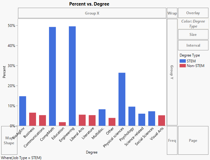
7. In the Graph Builder column list, select Degree Type and drag it to the Color zone.
Figure 4.3 Bar Chart Colored by Degree Type
8. In the legend, change the bar colors according to degree type:
– Right-click STEM and change the fill color to purple.
– Right-click Non-STEM and change the fill color to yellow.
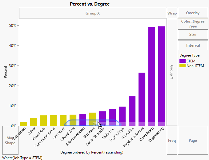
9. In the Graph Builder column list, select Percent and drag it above the X axis. See Figure 4.4.
Figure 4.4 Ordering Degree by Percent
This orders the degree by percent in ascending order. However, you want it to be in descending order.
10. Right-click the X axis and select Order By > Percent, descending.
11. Click the graph title and type Graduates Employed in STEM Jobs and press Enter.
12. Click Done.
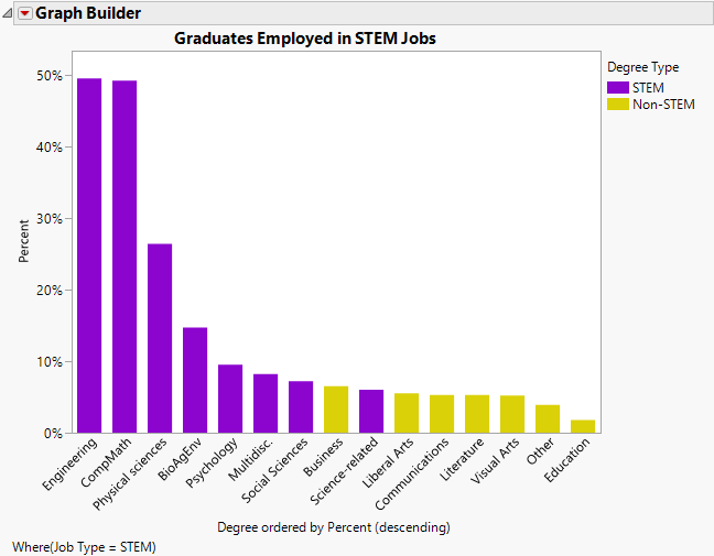
Figure 4.5 Completed Bar Chart
This graph displays the percent of graduates employed in STEM jobs by their degree type. Nearly 50% of Engineering and CompMath graduates are employed in STEM jobs, as compared to less than 2% of Education graduates.


