Example of Automatically Updating an Analysis
This example uses financial data for 32 companies from the pharmaceutical and computer industries. Using the Automatic Recalc feature, exclude an outlier to see the impact on the updated graph.
1. Select Help > Sample Data Folder and open Companies.jmp.
2. Select Analyze > Fit Y by X.
3. Select Sales ($M) and click Y, Response.
4. Select # Employees and click X, Factor.
5. Click OK.
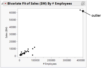
Figure 8.2 Initial Scatterplot
The initial scatterplot shows that one company has significantly more employees and sales than the other companies. You decide that this company is an outlier, and you want to exclude that point. Before you exclude the point, turn on Automatic Recalc so that your scatterplot is updated automatically when you make the change.
6. To turn on Automatic Recalc, click the red triangle next to Bivariate Fit of Sales ($M) By # Employees and select Redo > Automatic Recalc.
7. Click the outlier to select it.
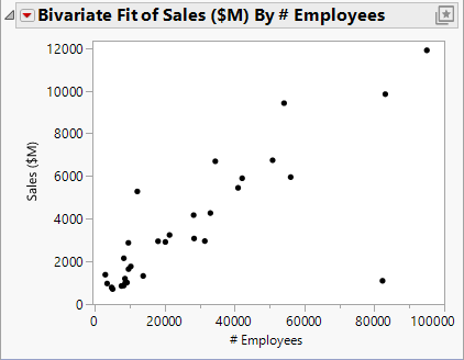
8. Select Rows > Exclude/Unexclude. The point is excluded from the analysis and the scatterplot is automatically updated.
Figure 8.3 Updated Scatterplot
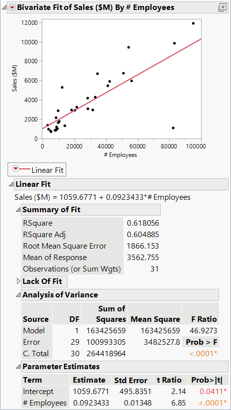
If you fit a regression line to the data, the point in the lower right corner is an outlier, and influences the slope of the line. If you then exclude the outlier with Automatic Recalc turned on, you can see the slope of the line change.
9. To fit a regression line, click the red triangle next to Bivariate Fit of Sales ($M) By # Employees and select Fit Line. Figure 8.4 shows the regression line and analysis results added to the report window.
Figure 8.4 Regression Line and Analysis Results
10. Click the outlier to select it.
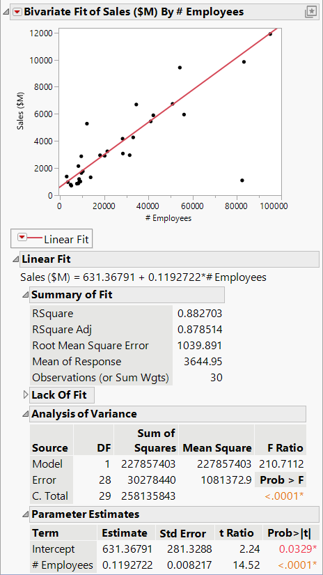
11. Select Rows > Exclude/Unexclude. The regression line and analysis results are automatically updated, reflecting the exclusion of the point.
Tip: When you exclude a point, the analyses are recalculated without the data point, but the data point is not hidden in the scatterplot. To also hide the point in the scatterplot, select the point, and then select Rows > Hide and Exclude.
Figure 8.5 Updated Regression Line and Analysis Results


