Example of Control Limits
This example uses Control Chart Builder in three stages. In most cases, you would start with Create the Baseline Control Chart, where you let JMP calculate the control limits for you. Then, to apply these control limits to new data, you would either Specify Control Limits or Specify Multiple Sets of Control Limits (for phase data).
In this example, consider a company’s printing process. Variations can cause distortion in the line, including skew, thickness, and length problems. In this example, consider the length of the line. A line is considered good if it has a printed length of 16 cm +/- 0.2 cm. Any longer and the sentence might run off of the page. Any shorter and there would be a lot of wasted space on the page. For every print run, the first and last books are taken for measurement. The line lengths are measured on a specified page in the middle of each book.
You want to know: Is this process in control (stable)? Are we getting consistent print quality? What happens when we make improvements to the printing process? Does quality improve? To answer these questions, we need to create control charts and use control limits.
Create the Baseline Control Chart
First, examine whether the existing process is in control. If it is, we can use the control limits created by JMP as our baseline or historical limits.
1. Select Help > Sample Data Folder and open Quality Control/Line Length.jmp.
2. Select Analyze > Quality and Process > Control Chart Builder.
3. Drag Length to the Y zone.
An Individual and Moving Range chart of Length appears. This chart is appropriate if you have no natural subgrouping in your data. However, in this example, there is a natural subgrouping, which is each print run.
4. Drag Run to the Subgroup zone (at bottom).
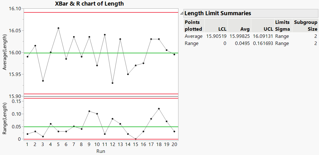
Figure 3.12 XBar and R Chart of Line Length by Print Run
Three lines are drawn horizontally across the XBar and R charts. These are the calculated LCL (lower control limit), Avg (average) and UCL (upper control limit).
Ideally, we would like for all of our points to fall within the control limits, and we would like for the points to fall randomly within these limits. Looking at the graph, we see that no points fall outside of the control limits, and there does not appear to be a pattern to the points. To investigate further, perform Western Electric tests to check for patterns and trends that would cause these tests to fail. (The Western Electric tests are also referred to as Nelson tests.)
5. In the XBar chart, right-click and select Warnings > Tests > All Tests.
Notice that no points were circled or flagged. This means that our process is in control or stable.
If we had determined that our process was not in control, we would investigate out of control points or work to alter our process so that it is in control. For this example, since the process is already in control or stable, we can skip that step. Now, you can use these control limits with new data. Proceed to Specify Control Limits, or Specify Multiple Sets of Control Limits (to see an example with phase data).
Specify Control Limits
Since we established that the process is in control, we can use these historical limits with new data to see how the new data compares to the existing process. To use historical limits, we need to specify control limits instead of having JMP calculate them.
There are several ways to specify control limits in JMP:
• Use the Get Control Limits Option
Set Control Limits Option
One simple way to specify control limits is to use the Set Control Limits option in Control Chart Builder.
1. Select Help > Sample Data Folder and open Quality Control/New Length Data.jmp.
This is the table that contains your new data.
2. Select Analyze > Quality and Process > Control Chart Builder.
3. Drag Length to the Y zone.
4. Drag Run to the Subgroup zone (at bottom).
5. Right-click in the Average (XBar) chart and select Limits > Set Control Limits.
6. Enter these limits:
– LCL - 15.90519
– Avg - 15.99825
– UCL - 16.09131
These are the historical limits from the Average (XBar) chart in Figure 3.12.
7. Click OK.
8. Right-click in the Range (R) chart and select Limits > Set Control Limits.
9. Enter these limits:
– LCL - 0
– Avg - 0.0495
– UCL - 0.161693
These are the historical limits from the Range (R) chart in Figure 3.12.
10. Click OK.
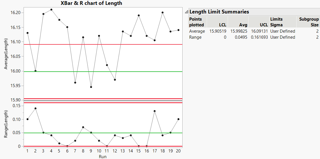
Figure 3.13 XBar and R Chart of Line Length with Historical Limits
Rather than calculating limits from the data, JMP used the historical control limits that you defined. In the Length Limit Summaries table, notice that the Limits Sigma now says User Defined. Many points now fall outside of the limits. Also, the averages are higher than those of the baseline process. This process appears different from the original process that we used to calculate the baseline control limits.
Add a Column Property
Another way to specify control limits is to add the Control Limits column property to a column in your new data table.
1. Select Help > Sample Data Folder and open Quality Control/New Length Data.jmp.
This is the table that contains your new data.
2. Select the Length column and click Cols > Column Info.
3. Click Column Properties > Control Limits.
4. XBar is selected, so enter these fixed limits for the Average (XBar) chart:
– Avg - 15.99825
– LCL - 15.90519
– UCL - 16.09131
These are the historical limits from the Average (XBar) chart in Figure 3.12.
Leave the value for Subgroup Size as missing. This value is not used in the Control Chart Builder platform.
5. Click XBar > R. Enter these fixed limits for the Range (R) chart:
– Avg - 0.0495
– LCL - 0
– UCL - 0.161693
These are the historical limits from the Range (R) chart in Figure 3.12.
Leave the value for Subgroup Size as missing. This value is not used in the Control Chart Builder platform.
6. Click OK.
You have entered control limits for XBar and R charts for the Length column. Now you can create a control chart.
7. Select Analyze > Quality and Process > Control Chart Builder.
8. Drag Length to the Y zone.
9. Drag Run to the Subgroup zone (at bottom).
The control chart is identical to Figure 3.13.
Use the Get Control Limits Option
The Get Control Limits method of specifying control limits is the most flexible. You should use this method in the following cases:
• If you have control limits for many different processes
• If you have different control limits for each phase (see Specify Multiple Sets of Control Limits)
To use the Get Control Limits method, you need a data table that defines your historical limits. For more information about how to create a limits table, see “Saving and Retrieving Limits”.
Note: When no subgroup variable is specified, the Get Control Limits option uses the subgroup size (_Sample Size) from the limits table. Also, when the limits are missing in the file, JMP also looks for the sigma (_Std Dev). When no LCL or UCL are specified in the limits file (if both the average and sigma are found, and the subgroup size is constant), the option sets the limits based on the average, subgroup size, and sigma.
In this example, a limits data table has already been created.
1. Select Help > Sample Data Folder and open Quality Control/New Length Data.jmp.
This is the table that contains your new data.
2. Select Analyze > Quality and Process > Control Chart Builder.
3. Drag Length to the Y zone.
4. Drag Run to the Subgroup zone (at bottom).
5. Click the Control Chart Builder red triangle and select Limits > Get Control Limits.
6. Select Other and click OK.
7. Navigate and open the limits data table for this example, called Length Limits.jmp. By default, the file is located here:
– On Windows: C:\Program Files\JMP\JMP\18\Samples\Data\Quality Control
– On macOS: \Library\Application Support\JMP\18\Samples\Data\Quality Control
The control chart is identical to Figure 3.13.
Exclude Rows
Another way to specify control limits is to exclude rows in a data table. One advantage to this method is that you can see both the historical data and new data in the same graph. This can help to visualize and investigate differences when they occur between the data collection periods.
To use this method, you must meet the following criteria:
• New and old data must reside in the same data table.
• Historical data and new data must all have equal subgroup sizes.
• All new data must be excluded in the data table (using Rows > Exclude/Unexclude).
In this example, new data have already been excluded.
1. Select Help > Sample Data Folder and open Quality Control/Combined.jmp.
This table contains old and new data, and the rows corresponding to the new data are excluded.
2. Select Analyze > Quality and Process > Control Chart Builder.
3. Drag Length to the Y zone.
4. Drag Run to the Subgroup zone (at bottom).
5. In the XBar chart, right-click and select Warnings > Tests > All Tests.
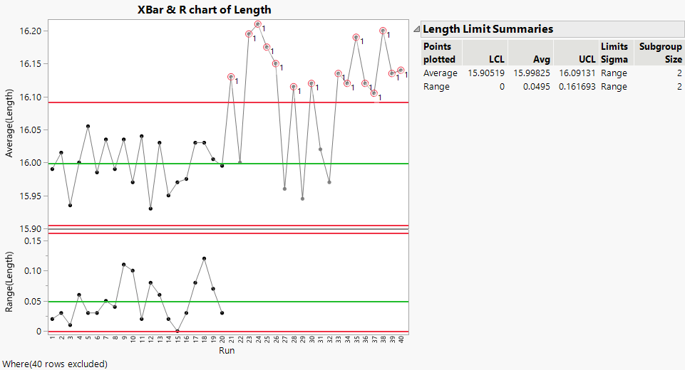
Figure 3.14 XBar and R Chart of Line Length with Excluded Data
JMP uses only the unexcluded rows (historical data) to create the control limits. The new data (excluded data) are plotted on the graph (dimmed), but these data were not used in any of the calculations. However, when you turn on the tests, all of the data is tested. The new data has many points that fall outside of the control limits and are flagged as failing Test 1 (point is more than 3σ from the average).
Specify Multiple Sets of Control Limits
In this example, you want to set different control limits for different phases of a process. The column property, set control limits, and excluded row state methods will not work in this situation because these methods are limited to only one set of control limits for the entire chart. For a control chart with phases, you need to use the get control limits method.
In the printing company, the goal is to reduce the variability of the force needed to break the bond between paper and the book spine for three different sites. Each site has different machines, different operators, and is also located in different countries; therefore, each site has a unique set of historical limits. For all three sites, the company does the following:
1. Creates a baseline control chart based on the existing process data.
2. Changes the process, based on a designed experiment.
3. Gathers data from the new process.
4. Creates a new control chart based on the new process data.
The goal is to plot the new data on a control chart using historical limits from the old process. In this way, the printing company can compare the new process to the old process limits.
Create a Control Chart Based on Existing Process
1. Select Help > Sample Data Folder and open Quality Control/Phase Historical Data.jmp.
This table contains the existing process data for all three sites.
2. Select Analyze > Quality and Process > Control Chart Builder.
3. Drag Force to the Y zone.
4. Drag Run to the Subgroup zone (at bottom).
5. Drag Site to the Phase zone.
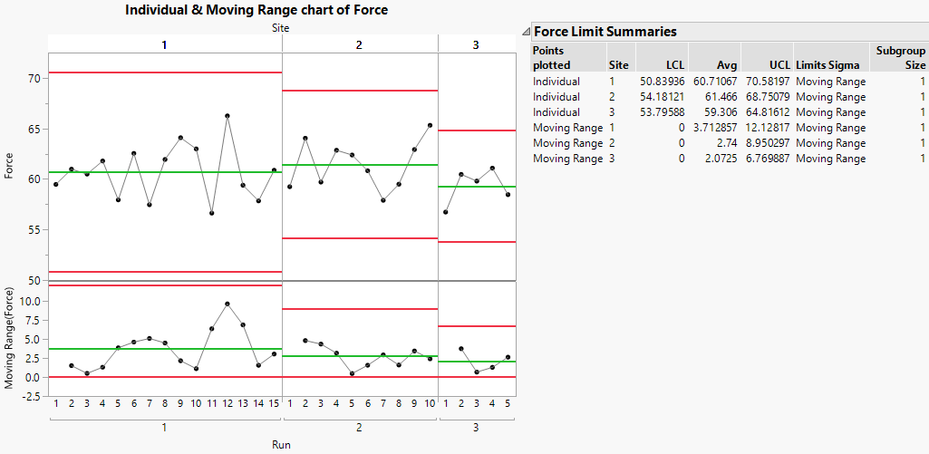
Figure 3.15 Baseline Control Chart for Existing Data
Create a Control Chart Based on Updated Process
1. From the report in Figure 3.15, click the Control Chart Builder red triangle and select Limits > Save Control Limits > in New Table.
This creates a limits table.
2. Save this new limits table to any location, so you can access it later.
3. Select Help > Sample Data Folder and open Quality Control/Phase New Data.jmp.
This data was collected from all three sites after the change was made to the process.
4. Select Analyze > Quality and Process > Control Chart Builder.
5. Drag Force to the Y zone.
6. Drag Run to the Subgroup zone (at bottom).
7. Drag Site to the Phase zone.
8. Click the Control Chart Builder red triangle and select Limits > Get Control Limits. Open the limits table that you saved in step 2.
This applies the historical limits to the new data in the Control Chart Builder report.
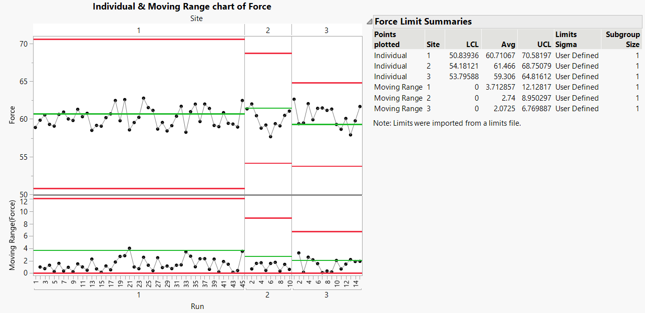
Figure 3.16 Control Chart for New Data Based on Historical Limits
Now you can see how the new data (after the process change) compare with the historical process limits (before the process change). None of the points fall outside of the control limits for either the location or dispersion chart. The goal was to reduce variability. Looking at the moving range chart, you can see that most points fall below the average line. For sites 1 and 2, it is clear that the variability of force needed to break the bond between pages and the book spine has been decreased. The decrease at Site 3 is not as strong as at sites 1 and 2. The improvements to the printing process appear to have succeeded in reducing the variability.
