Interaction Plots
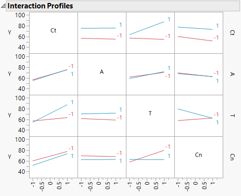
When there are interaction effects in the model, the Interaction Plots option in the Fit Least Squares report shows a matrix of interaction plots. Each cell of the matrix contains a plot whose horizontal axis is scaled for the effect displayed in the column in which the plot appears. Line segments are plotted for the interaction of that effect with the effect displayed in the corresponding row. So, an interaction plot shows the interaction of the row effect with the column effect.
A line segment is plotted for each level of the row effect. Response values predicted by the model are joined by line segments. Non-parallel line segments give visual evidence of possible interactions. However, the p-value for such a suggested interaction should be checked before concluding that it exists. Figure 3.33 shows an interaction plot matrix for the Reactor.jmp sample data table.
Figure 3.33 Interaction Plots
The plot corresponding to the T*Cn interaction is the third plot in the bottom row of plots or equivalently, the third plot in the last column of plots. Either plot shows that the effect of Cn on Y is fairly constant at the low level of T, whether Cn is set at a high or low level. However, at the high level of T, the effect of Cn on Y differs based on its level. Cn at –1 leads to a higher predicted Y than Cn at 1. Note that this interaction is significant with a p-value < 0.0001.
In certain designs, two-way interactions are aliased with other two-way interactions. When this aliasing occurs, cells in the Interaction Profiles plot corresponding to these interactions are dimmed.
