Mosaic Plot
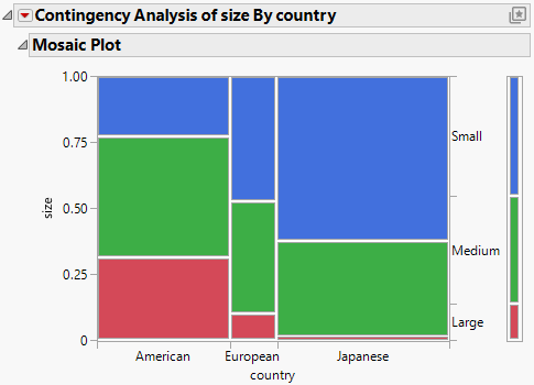
In the Contingency platform, the mosaic plot is a graphical representation of the two-way frequency table, which is also called a contingency table. A mosaic plot is divided into rectangles of varying dimensions; the vertical length of each rectangle is proportional to the proportions of the Y variable within each level of the X variable. The mosaic plot was introduced by Hartigan and Kleiner (1981) and refined by Friendly (1994).
Figure 7.5 Example of a Mosaic Plot
Note the following about the mosaic plot:
• The width of the partitions on the horizontal axis represent the number of observations for each level of the X variable.
• The proportions on the vertical axis on the right side of the plot represent the overall proportions of the levels of the Y variable for the combined levels of the X variable. These proportions represent the null hypothesis of no association between the X and Y variables.
• The scale of the vertical axis on the left side of the plot shows the response probability. The whole axis is equivalent to a probability of one, which represents the total sample.
Tip: You can click on a rectangle in the mosaic plot to highlight the selection and highlight the corresponding rows in the associated data table. You can right-click on a rectangle to add labels to the plot.
Mosaic Plot Pop-Up Menu
In the Contingency report, right-click the mosaic plot to change colors and label the cells. Each portion of the plot has an independent menu.
Set Colors
Shows the current assignment of colors to levels and enables you to update the assignments. See Set Colors.
Cell Labeling
Specifies the label to be drawn in each cell of the mosaic plot.
No Labels
Shows no labels, and removes any labels that were previously added.
Label by Count
Shows the number of observations in each cell.
Label by Percent
Shows the percent of observations in each cell.
Label by Value
Shows the levels of the Y variable corresponding to each cell.
Label by Row
Shows the row labels for all of the rows represented by the cell.
Line Color
Specifies a line color for the lines around each cell.
Line Style
Specifies a line style for the lines around each cell.
Line Width
Specifies the line width for the lines around each cell.
Transparency
Specifies the transparency for the cell colors.
Note: For descriptions of the remainder of the options in the pop-up menu, see “JMP Reports” in Using JMP.
Set Colors
When you select the Set Colors option in the mosaic plot pop-up menu, the Select Colors for Values window appears. When this window initially opens, it shows the current assignment of colors to levels.
The default mosaic colors depend on whether the Y response column is ordinal or nominal, and whether it has an existing Value Colors column property. To change the color for any level, click the oval in the second column of colors and select a new color.
The Select Colors for Values window contains the following options:
Macros
Updates the colors using one of the following methods:
Gradient Between Ends
Applies a color gradient to all levels of the variable.
Gradient Between Selected Points
Applies a color gradient only to the levels that you have selected. You can select a range of levels by dragging the cursor over the levels that you want to select, or by pressing the Shift key and clicking the first and last level.
Reverse Colors
Reverses the order of the colors.
Revert to Old Colors
Reverts any changes that have been made since the Select Colors for Values window was opened.
Color Theme
Updates the colors for each value based on a color theme.
Save Colors to Column
Enables you to save the updated colors to the data table. If you change the color theme and select this check box, a Value Colors column property is added to the column in the associated data table. To edit this property from the data table, select Cols > Column Info.
