Compare Multiple Variables Using Side-by-Side Box Plots
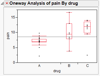
Side-by-side box plots show relationships and differences in the data.
• the relationship between one continuous variable and one categorical variable
• differences in the continuous variable across levels of the categorical variable
Figure 4.18 Example of Side-by-Side Box Plots
Scenario
This example uses the Analgesics.jmp data table, which contains data on pain measurements taken on patients using three different drugs.
A researcher wants to explore the following questions:
• Are there differences in the average amount of pain control among the drugs?
• Does the variability in the pain control given by each drug differ? A drug with high variability would not be as reliable as a drug with low variability.
To answer these questions, use a side-by-side box plot for the pain levels and the drug categories.
Create the Side-by-Side Box Plots
1. Select Help > Sample Data Folder and open Analgesics.jmp.
2. Select Analyze > Fit Y by X.
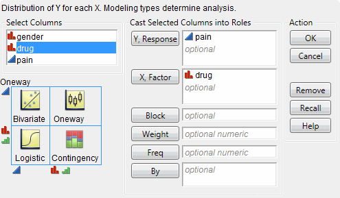
3. Select pain and click Y, Response.
4. Select drug and click X, Factor.
Figure 4.19 Fit Y by X Window
5. Click OK.
6. Click the red triangle next to Oneway Analysis of pain By drug and select Display Options > Box Plots.
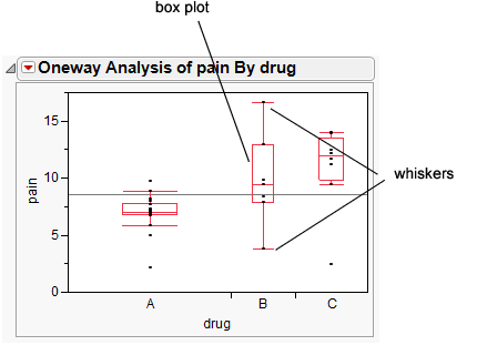
Figure 4.20 Side-by-Side Box Plots
Interpret the Side-by-Side Box Plots
Box plots are designed according to the following principles:
• The line through the box represents the median.
• The middle half of the data is within the box.
• The majority of the data falls between the ends of the whiskers.
• A data point outside the whiskers might be an outlier.
The box plots in Figure 4.20 show these answers:
• There is evidence to believe that patients on drug A feel less pain, since the box plot for drug A is lower on the pain scale than the others.
• Drug B appears to have higher variability than Drugs A and C, since the box plot is taller.
There is one point for drug C that is a lot lower than the other points for drug C. Hover over the lower point to see that it is row 26 of the data table. That point looks like it is more similar to the data in drug group A or B. The information in row 26 deserves investigation. There might have been a typographical error when the data was recorded.


