Publication date: 06/27/2024
Contour Plot in JMP
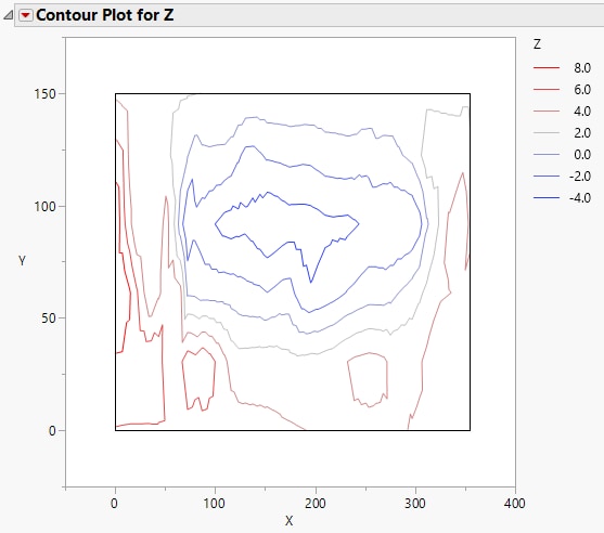
The legend for the contour plot shows individual markers and colors for the Y variable. Replace variables in the plot by dragging and dropping a variable, in one of two ways: swap existing variables by dragging and dropping a variable from one axis to the other axis; or, click a variable in the Columns panel of the associated data table and drag it onto an axis.
For information about additional options for the report, see Contour Plot Platform Options.
Follow the instructions in Example of a Contour Plot to produce the plot shown in Figure 10.5.
Figure 10.5 The Contour Plot Report
Want more information? Have questions? Get answers in the JMP User Community (community.jmp.com).
