Distributions of Continuous Variables
Analyzing a continuous variable might include questions such as the shape and average of the data.
• Does the shape of the data match any known distributions?
• Are there any outliers in the data?
• What is the average of the data?
• Is the average statistically different from a target or historical value?
• How spread out are the data? In other words, what is the standard deviation?
• What are the minimum and maximum values?
You can answer these and other questions with graphs, summary statistics, and simple statistical tests.
Scenario
This example uses the Car Physical Data.jmp data table, which contains information about 116 different car models.
A planning specialist has been asked by a railroad company to determine the possible issues involved in transporting cars by train. Using the data, the planning specialist wants to explore the following questions:
• What is the average car weight?
• How spread out are the cars’ weights (standard deviation)?
• What are the minimum and maximum weights of cars?
• Are there any outliers in the data?
Use a histogram of weight to answer these questions.
Create the Histogram
1. Select Help > Sample Data Folder and open Car Physical Data.jmp.
2. Select Analyze > Distribution.
3. Select Weight and click Y, Columns.
4. Click OK.
5. To rotate the report window, click the Weight red triangle and select Display Options > Horizontal Layout.
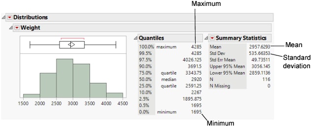
Figure 5.7 Distribution of Weight
The report window contains three sections:
• A histogram and a box plot to visualize the data.
• A Quantiles report that shows the percentiles of the distribution.
• A Summary Statistics report that shows the mean, standard deviation, and other statistics.
Interpret the Distribution Results
Using the results presented in Figure 5.7, the planning specialist can answer the questions.
What is the average car weight?
The Histogram shows a weight of around 3,000 lbs. The Summary Statistics show a mean weight of around 2,958 lbs.
How spread out are the weights (standard deviation)?
The Summary Statistics show a standard deviation of around 536 lbs.
What are the minimum and maximum weights?
The Histogram shows a minimum of around 1,500 lbs. and a maximum of around 4,500 lbs. The Quantiles show a minimum of 1,695 lbs. and a maximum of 4,285 lbs.
Are there any outliers?
No.
The default report window in Figure 5.7 provides a minimal set of graphs and statistics. Additional graphs and statistics are available on the red triangle menu.
Draw Conclusions
Based on other research, the railroad company has determined that an average weight of 3000 pounds is the most efficient to transport. Now, the planning specialist needs to find out whether the average car weight in the general population of cars that they might transport is 3000 pounds. Use a t test to draw inferences about the broader population based on this sample of the population.
Test Conclusions
1. Click the Weight red triangle and select Test Mean.
2. In the window that appears, type 3000 in the Specify Hypothesized Mean box.
3. Click OK.
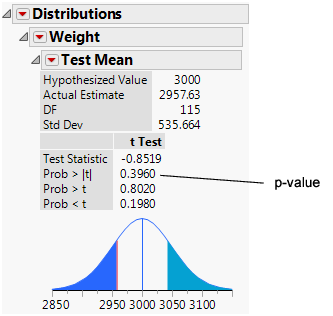
Figure 5.8 Test Mean Results
Interpret the t Test
The primary result of a t test is the p-value. In this example, the p-value is 0.396 and the analyst is using a significance level of 0.05. Since 0.396 is greater than 0.05, you cannot conclude that the average weight of car models in the broader population is significantly different from 3000 pounds. Had the p-value been lower than the significance level, the planning specialist would have concluded that the average car weight in the broader population is significantly different from 3000 pounds.

