Example of a Dynamic Bubble Plot
This example contains population data for countries and regions around the world. Use a bubble plot to examine the relationship between the proportion of younger and older people in the sample populations.
1. Select Help > Sample Data Folder and open PopAgeGroup.jmp.
2. Select Graph > Bubble Plot.
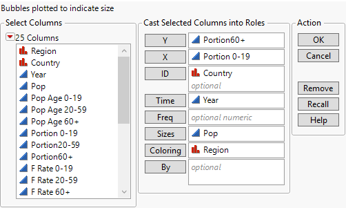
The launch window appears.
Figure 5.2 The Bubble Plot Launch Window
3. Select Portion60+ and click Y.
The portion of the population that are 60 years or older becomes the y coordinate.
4. Select Portion 0-19 and click X.
The portion of the population that are 0-19 years becomes the x coordinate.
5. Select Country and click ID.
All the rows for each country are aggregated into a single bubble.
6. Select Year and click Time.
The bubble plot shows a unique plot for each year’s data.
7. Select Pop and click Sizes.
The sizes of the bubbles reflect the overall population values.
8. Select Region and click Coloring.
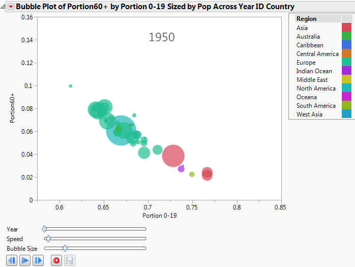
Bubbles for different regions are assigned different colors. See the Region legend in Figure 5.3. The colors shown in the plot are JMP default colors.
9. Click OK.
The report window appears.
Figure 5.3 The Bubble Plot Report Window
10. Click the play button to see the animated, dynamic report. Alternatively, you can click the previous button to move forward by one year.
11. (Optional) To view a legend that identifies each color with its region, click the Bubble Plot red triangle and select Legend.
As time progresses, you can see that the portion of the population that is 0-19 years decreases, and the portion of the population that is 60 years or more increases.

