Example of a Map Chart
|
Data |
This example uses data from 2017 of commodity acres planted in states within the US that grow corn, wheat, and soybeans. Note: These data come from the United States Department of Agriculture (2017). |
|
Techniques |
This example uses map shapes and legend customization. |
|
Goal |
The goal of this example is to show the median number of commodity acres that have been planted per state. |
1. Select Help > Sample Data Folder and open Corn Wheat Soybean Production.jmp.
2. Select Graph > Graph Builder.
3. Select State and drag it to the Map Shape zone.
Note: JMP recognizes US State names as map shapes. For more information, see Map Shape Zone.
4. Select Commodity Acres Planted and drag it to the Color zone.
5. In the Map Shapes properties panel, change the Summary Statistic to Median.
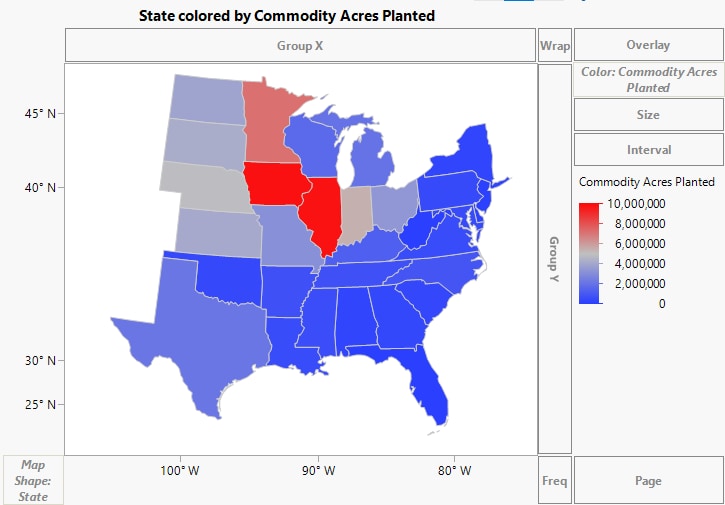
Figure 4.11 Map Showing Median Commodity Acres Planted
6. Customize the graph elements in the legend:
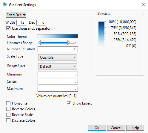
a. In the legend color bar, right-click and select Gradient.
b. Next to Width, enter 12.
c. Next to Color Theme, click the color bar. Under Sequential, click the 2nd option (white to blue) and then click OK.
d. From the Scale Type list, choose Quantile.
Figure 4.12 Completed Gradient Settings Window
e. Click OK.
7. Click the title above the graph and type State Colored by Median Commodity Acres Planted.
8. Right-click in the graph and select Hover Label > Bar.
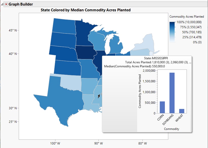
This adds a bar chart hover graph. When you hover over a state, you can see the proportions of the commodities grown in that state in a bar chart.
Note: For more information about Hover Labels, see Customize Hover Labels in JMP Graphs in Using JMP.
9. Click Done.
10. Hover over a state (in this case, Mississippi).
Figure 4.13 Completed Map Colored by Median Commodity Acres Planted
The coloring on the map highlights the states with the highest number of acres of wheat, corn, and soybeans. The dark blue states are known as America’s Breadbasket. The hover graphs enable you to explore the proportions of the three crops grown in a state. This example shows that in Mississippi, soybeans are the prominent crop.
Tip: To see other examples using Graph Builder, run the additional scripts in the Corn Wheat Soybean Production.jmp data table.


