Example of an Attribute Gauge Chart
You want to examine how effective raters are in correctly classifying parts, and how well raters agree with each other and with themselves over the course of the ratings. In this example, three raters are indicating if a part passed (0) or failed (1) for 50 parts, three times each.
1. Select Help > Sample Data Folder and open Attribute Gauge.jmp.
2. Select Analyze > Quality and Process > Variability / Attribute Gauge Chart.
3. For Chart Type, select Attribute.
4. Select A, B, and C and click Y, Response.
5. Select Standard and click Standard.
6. Select Part and click X, Grouping.
7. Click OK.
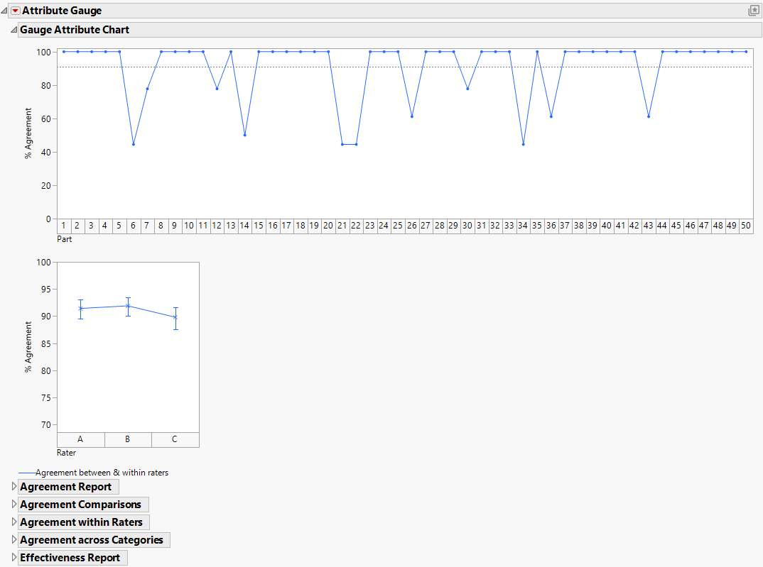
Figure 7.3 Example of an Attribute Chart
The first chart (Part) shows how well the raters agreed with each other for each part. For example, here you can see that the percent agreement dropped for part 6, 12, 14, 21, 22, and so on. These parts might have been more difficult to categorize.
The second chart (Rater) shows each rater’s agreement with him or herself and the other raters for a given part, summed up over all of the parts. In this example, it looks like the performance of the raters is relatively similar. Rater C had the lowest agreement, but the difference is not major (about 89% instead of 91%).
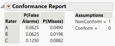
8. Open the Effectiveness Report and scroll down to the Conformance Report.
You can see that 0 = non-conform (fail) and a 1 = conform (pass). However, in this data, it is exactly the opposite: 0 is a pass and 1 is a fail. Reverse this setting.
9. Click the Conformance Report red triangle and select Change Conforming Category.
Figure 7.4 Conformance Report

