Example of Control Chart Builder
In this example, use Control Chart Builder interactively and through the launch window to investigate an increase in the number of defects in a production process. The launch window approach is convenient if you know which type of control chart you want to build.
Control Chart Builder Interactive Method
Use the interactive Control Chart Builder workspace to investigate the variability in the process data.
1. Select Help > Sample Data Folder and open Quality Control/Socket Thickness.jmp.
2. Select Analyze > Quality and Process > Control Chart Builder.
3. Drag Thickness to the Y zone.
4. Drag Hour to the Subgroup zone (at bottom).
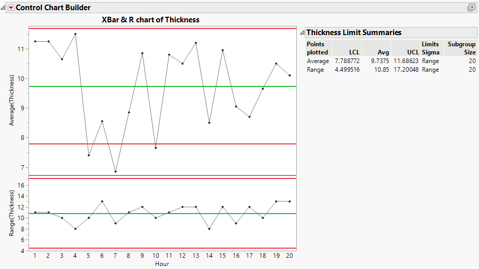
Figure 3.2 Control Charts for Socket Thickness
Looking at the Average chart, you can see that there are several points below the lower control limit of 7.788772. You want to see whether another variable might be contributing to the problem.
5. Drag Cavity into the Phase zone.
6. Click Done.
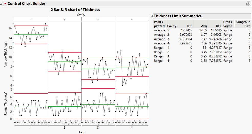
Figure 3.3 Control Charts for Each Cavity
From the Average chart, you can conclude the following:
• There are differences between the cavities, indicating the need for separate control limits for each cavity.
• Cavity 1 is producing sockets with an average thickness above that of the other cavities. This indicates that further investigation of the differences between cavities is warranted.
• All of the cavities have points that are outside the control limits. Therefore, you should investigate the lack of control in the process for each cavity.
The Range chart for each cavity shows that the within-subgroup measurements are in control and are similar across cavities.
Control Chart Builder Launch Window Method
Use the XBar Control Chart launch window to obtain the same chart as Figure 3.3.
1. Select Help > Sample Data Folder and open Quality Control/Socket Thickness.jmp.
2. Select Analyze > Quality and Process > Control Chart > XBar Control Chart.
3. Select Thickness and click Y.
4. Select Hour and click Subgroup.
5. Select Cavity and click Phase.
6. Click OK.
You should see the same control chart that appears in Figure 3.3.

