Example of Correspondence Analysis
Use the Contingency platform to perform a correspondence analysis for a cheese tasting experiment. The experiment recorded the counts of nine different response levels across four different cheese additives. Correspondence analysis provides a visualization of the associations across levels when an association across variables is established.
1. Select Help > Sample Data Folder and open Cheese.jmp.
2. Select Analyze > Fit Y by X.
3. Select Response and click Y, Response.
The Response values range from one to nine, where one is the least liked, and nine is the best liked.
4. Select Cheese and click X, Factor.
A, B, C, and D represent four different cheese additives.
5. Select Count and click Freq.
6. Click OK.
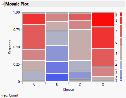
Figure 7.8 Mosaic Plot for the Cheese Data
From the mosaic plot, notice that the rankings differ across the cheese types. In particular, Cheese B is ranked consistently lower than the other cheeses. A correspondence analysis might be the next step in the analysis.
7. To see the correspondence analysis plot, click the Contingency Analysis red triangle menu and select Correspondence Analysis.
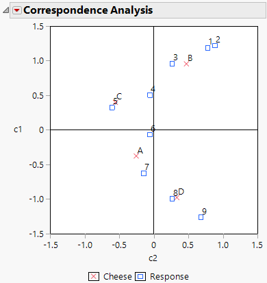
Figure 7.9 Example of a Correspondence Analysis Plot
Figure 7.9 shows the correspondence analysis graphically, where the plot axes are labeled c1 and c2. Notice the following:
• The c1 axis appears to explain the general satisfaction level. The cheeses on the c1 axis go from least liked at the top to most liked at the bottom.
• Cheese D is the most liked cheese, with responses of 8 and 9.
• Cheese B is the least liked cheese, with responses of 1, 2, and 3.
• Cheeses C and A are in the middle, with responses of 4, 5, 6, and 7.

