The Importance of Graphing Your Data
Graphing, or visualizing, your data is important to any data analysis, and should always occur before the use of statistical tests or model building. To illustrate why data visualization should be an early step in your data analysis process, consider the following example:
1. Select Help > Sample Data Folder and open Anscombe.jmp (F. J. Anscombe (1973), American Statistician, 27, 17-21).
This data consists of four pairs of X and Y variables.
2. In the Table panel, click the green triangle next to the The Quartet script.
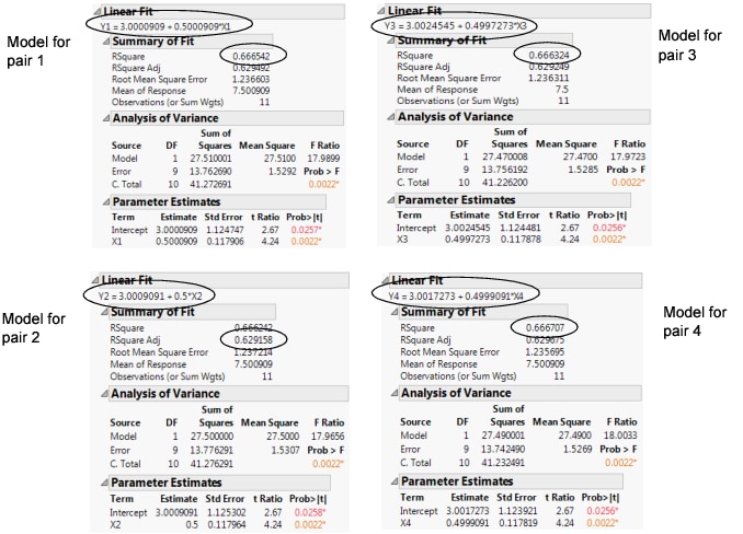
The script creates a simple linear regression on each pair of variables using Fit Y by X. The Show Points option is turned off, so that none of the data can be seen on the scatterplots. Figure 5.2 shows the model fit and other summary information for each regression.
Figure 5.2 Four Models
Notice that all four models and the RSquare values are nearly identical. The fitted model in each case is essentially Y = 3 + 0.5X, and the RSquare value in each case is essentially 0.66. If your data analysis took into account only the above summary information, you would likely conclude that the relationship between X and Y is the same in each case. However, at this point, you have not visualized your data. Your conclusion might be wrong.
To Visualize the Data, Add the Points to All Four Scatterplots
1. Press Ctrl.
2. Click the red triangle next to any one of the Bivariate Fits and select Show Points.
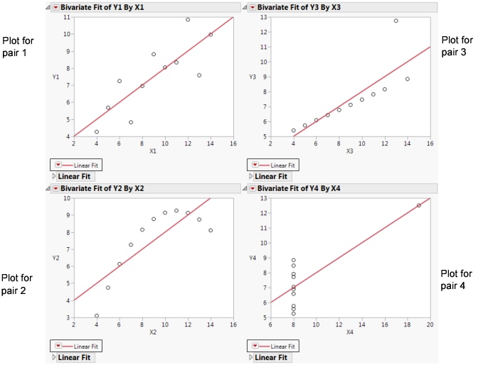
Figure 5.3 Scatterplots with Points Added
The scatterplots show that the relationship between X and Y is not the same for the four pairs, although the lines describing the relationships are the same:
• Plot 1 represents a linear relationship.
• Plot 2 represents a non-linear relationship.
• Plot 3 represents a linear relationship, except for one outlier.
• Plot 4 has all the data at x = 8, except for one point.
This example illustrates that conclusions that are based on statistics alone can be inadequate. A visual exploration of the data should be an early part of any data analysis.

