The Pareto Plot Report
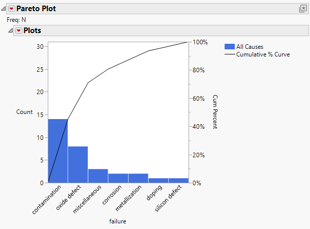
The Pareto plot combines a bar chart displaying percentages of variables in the data with a line graph showing cumulative percentages of the variables.
Figure 15.6 Pareto Plot Example
The Pareto plot can chart a single Y (process) variable with no X classification variables, with a single X, or with two X variables. The Pareto plot does not distinguish between numeric and character variables or between modeling types. All values are treated as discrete, and bars represent either counts or percentages. The following list describes the arrangement of the Pareto plot:
• A Y variable with no X classification variables produces a single chart with a bar for each value of the Y variable. For an example, see Example of the Pareto Plot Platform.
• A Y variable with one X classification variable produces a row of Pareto plots. There is a plot for each level of the X variable with bars for each Y level. These plots are referred to as the cells of a comparative Pareto plot. There is a cell for each level of the X (classification) variable. Because there is only one X variable, this is called a one-way comparative Pareto plot. For an example, see Example of a One-Way Comparative Pareto Plot.
• A Y variable with two X variables produces rows and columns of Pareto plots. There is a row for each level of the first X variable and a column for each level of the second X variable. Because there are two X variables, this is called a two-way comparative Pareto plot. The rows have a Pareto plot for each value of the first X variable, as described previously. The upper left cell is called the key cell. Its bars are arranged in descending order. The bars in the other cells are in the same order as the key cell. You can reorder the rows and columns of cells. The cell that moves to the upper left corner becomes the new key cell and the bars in all other cells rearrange accordingly. For an example, see Example of a Two-Way Comparative Pareto Plot.
You can change the type of scale and arrangement of bars and convert the bars into a pie chart using the options in the Pareto Plot and Plots red triangle menus. See Pareto Plot Platform Options.
