Findings Time Trends
This report enables you to visualize findings measurements across the time line of the study.
Report Results Description
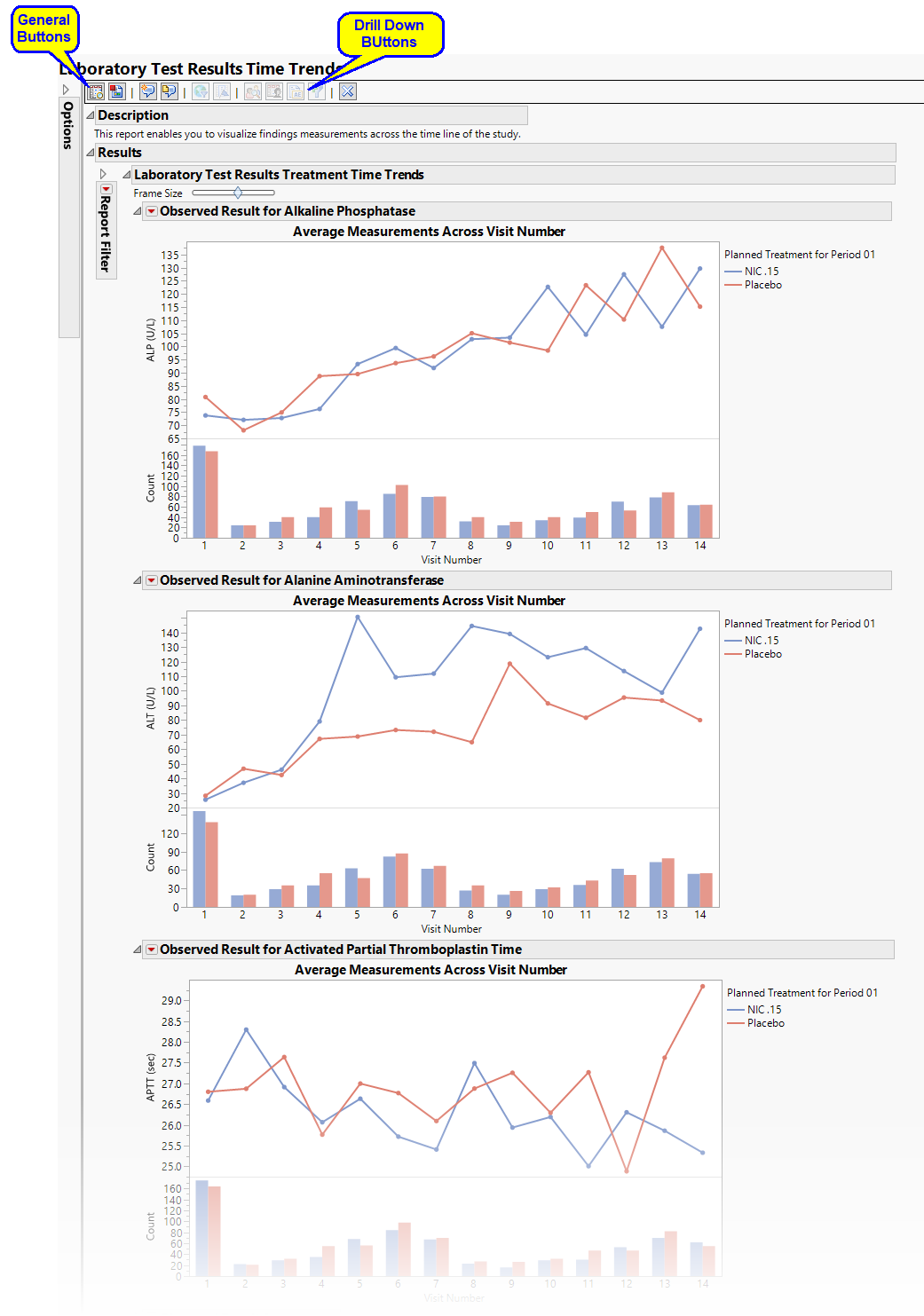
Running Findings Time Trends with the Nicardipine sample setting and LB findings domain generates the report shown below.

The Report contains the following sections:
Treatment Time Trends
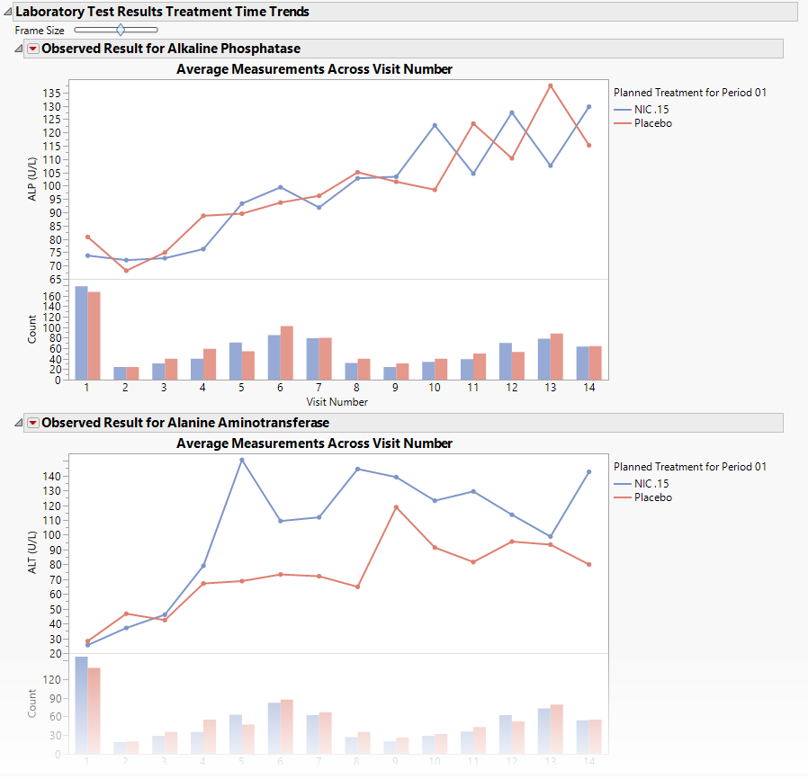
Shows a plot for each quantitative findings test (for example, laboratory) in the Findings data set that was analyzed. Each plot contains a line for each treatment group representing the average measurements taken across time.

The Treatment Time Trends section contains the following elements:
| • | A set of Treatment Level Time Trend Plots |
If findings test category (xxCAT) exists (where xx represents the two-letter domain abbreviation -- for example, LB), these plots are first ordered by xxCAT. Next, if findings test subcategory (xxSCAT) exists, plots are secondarily ordered by xxSCAT. If xxCAT is missing, plots are ordered by test short name (xxTESTCD), which is required. Findings tests with a missing xxCAT value are assigned to the “OTHER” category.
Note: Findings tests with a missing numeric result (xxSTRESN), as well as those taken on only one day, are excluded from these plots.
Tip: You can collapse categories (and simultaneously exclude them from any report that you create) by clicking on the gray triangles located to the left of the category labels.
Each plot displays the means of the measurements taken across time for each treatment arm in a study for a quantitative findings test. The value of xxTEST (where xx represents the two-letter domain abbreviation -- for example, LB) is displayed in the outline box for each plot, and the test short name (xxTESTCD) is displayed along with the measurement units (where applicable) on the Y axis. The Y axis can represent the observed test result, the change from baseline, percent change from baseline, or percent of baseline, depending on the selection made for the Plot findings measurements as: parameter on the report dialog. Time, as either Study Day, Study Week, or Visit, is plotted on the X axis (according to yourTime Scale selection). Time trend lines connect the points of measurement; each marker point represents the average findings measurement for subjects belonging to that treatment arm at the measured time point.
The Y axis can optionally be displayed with log scaling (this is very useful for interpreting laboratory findings). In addition, you can choose to compute and show standard error bars at each measured time point for each treatment group. These standard error bars can be helpful in visualizing significantly different measurements for a findings test at certain time points. Note that standard error calculations depend heavily on the number of measured subjects at a specific time point. These plotting options are found on the Output tab of the report dialog.
The time trend lines are interactive. Selecting a line selects all subjects belonging to the treatment group the selected line represents. You can then use the down buttons to profile, cluster, or show these subjects or to create a subject filter to do further analysis only with the selection of subjects. Selecting a treatment time trend line also selects and highlights all the individuals' subject time trend lines on the accompanying Subject Time Trends section that is part of the output from this report.
| • | Associated Bar Charts showing the number of subjects in each treatment group at each visit. |
Subject Time Trends
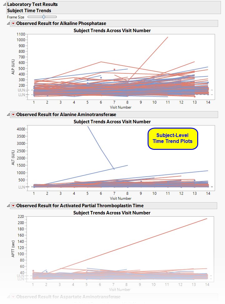
Shows a plot for each quantitative findings test (for example, laboratory) in the Findings data set that was analyzed. Each plot contains a line for each subject in the study representing the patient's measurements taken across time.

This section contains the following elements:
| • | A set of Subject Level Time Trends Plots also known as spaghetti plots |
If findings test category (xxCAT) exists (where xx represents the two-letter domain abbreviation -- for example, LB), these plots are first ordered by xxCAT. Next, if findings test subcategory (xxSCAT) exists, plots are secondarily ordered by xxSCAT. If xxCAT is missing, plots are ordered by test short name (xxTESTCD), which is required. Findings tests with a missing xxCAT value are assigned to the “OTHER” category.
Note: Findings tests with a missing numeric result (xxSTRESN), as well as those taken on only one day, are excluded from these plots.
Tip: You can collapse categories (and simultaneously exclude them from any report that you create) by clicking on the gray triangles located to the left of the category labels.
Each plot displays the measurements taken across time for each subject in a study for a quantitative findings test. The value of xxTEST is displayed in the outline box for each plot and the test short name (xxTESTCD) is displayed along with the measurement units (where applicable) on the Y axis. The Y axis can represent the observed test result, the change from baseline, percent change from baseline, or percent of baseline, depending on the selection made for the Plot findings measurements as: parameter on the report dialog. Time, as either Study Day, Study Week, or Visit, is plotted on the X axis (according to yourTime Scale selection). Time trend lines connect the points of measurement; each marker point represents the findings measurement for each subject at the measured time point. If multiple measurements were taken for a subject on the same Study Day, Study Week, or Visit, the point represents the mean measurement for that subject.
The Y axis can optionally be displayed with log scaling (this is very useful for interpreting laboratory findings). For the LB domain, you can also choose to draw reference limits by checking the Show ULN and LLN reference lines for lab tests option on the dialog. If there are multiple reference limits for a lab test, the maximum ULN (as measured by LBSTNRHI) and the minimum LLN (LBSTNRLO) are displayed.
The time trend lines are interactive. Selecting a line selects that subject. You can then use the down buttons to profile, cluster, or show selected subjects, or create a subject filter to do further analysis only with the selection of subjects.
Action Buttons
Action buttons, provide you with an easy way to drill down into your data. The following action buttons are generated by this report:
| • | Profile Subjects: Select subjects and click  to generate the patient profiles. See Profile Subjects for additional information. to generate the patient profiles. See Profile Subjects for additional information. |
| • | Show Subjects: Select subjects and click  to open the ADSL (or DM if ADSL is unavailable) of selected subjects. to open the ADSL (or DM if ADSL is unavailable) of selected subjects. |
| • | Cluster Subjects: Select subjects and click  to cluster them using data from available covariates. See Cluster Subjects for additional information. to cluster them using data from available covariates. See Cluster Subjects for additional information. |
| • | Demographic Counts: Select subjects and click  to create a data set of USUBJIDs, which subsets all subsequently run reports to those selected subjects. The currently available filter data set can be applied by selecting Demographic Counts in any report dialog. to create a data set of USUBJIDs, which subsets all subsequently run reports to those selected subjects. The currently available filter data set can be applied by selecting Demographic Counts in any report dialog. |
General
| • | Click  to view the associated data tables. Refer to View Data for more information. to view the associated data tables. Refer to View Data for more information. |
| • | Click  to generate a standardized pdf- or rtf-formatted report containing the plots and charts of selected sections. to generate a standardized pdf- or rtf-formatted report containing the plots and charts of selected sections. |
| • | Click  to take notes, and store them in a central location. Refer to Add Notes for more information. to take notes, and store them in a central location. Refer to Add Notes for more information. |
| • | Click  to read user-generated notes. Refer to View Notes for more information. to read user-generated notes. Refer to View Notes for more information. |
| • | Click  to open and view the Subject Explorer/Review Subject Filter. to open and view the Subject Explorer/Review Subject Filter. |
| • | Click  to specify Derived Population Flags that enable you to divided the subject population into two distinct groups based on whether they meet very specific criteria. to specify Derived Population Flags that enable you to divided the subject population into two distinct groups based on whether they meet very specific criteria. |
| • | Click the arrow to reopen the completed report dialog used to generate this output. |
| • | Click the gray border to the left of the Options tab to open a dynamic report navigator that lists all of the reports in the review. Refer to Report Navigator for more information. |
Note: The following notes: Multiple treatment periods have been detected and displayed. and Pre-treatment has been assigned to period=0. are inserted at the top of the report when these events are detected in your data.
Report Options

Findings Domain Tests
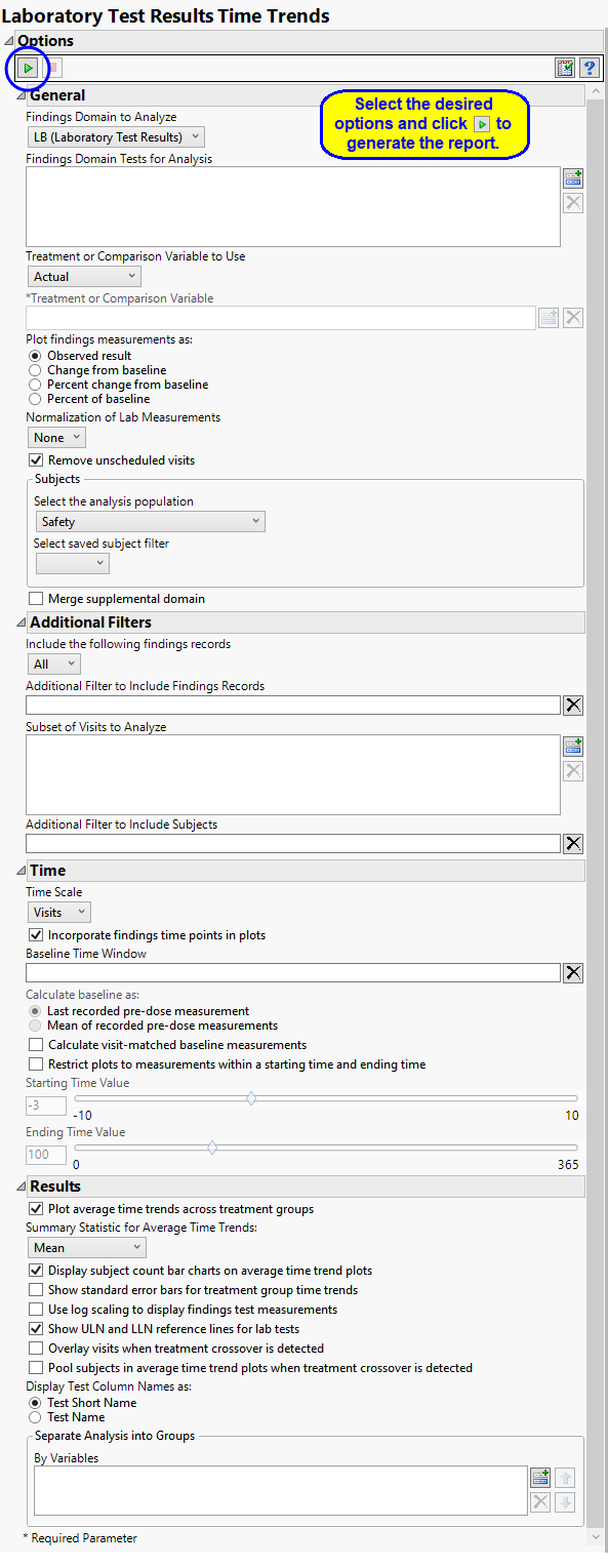
Use the Findings Domain to Analyze option to specify whether to plot the distribution of measurements from either the Electrocardiogram (EG), Laboratory (LB), or Vital Signs (VS) findings domains. LB is selected by default.
You can use the Findings Domain Tests for Analysis option to plot the distributions of one or more selected findings tests. Leaving the field blank (the default selection) plots the distributions for all available findings tests.
Treatment or Comparison Variable:
The primary goal of clinical trials is to distinguish treatment effects when reporting and analyzing trial results. Treatments are defined by specific values in the treatment or comparison variables of the CDISC models. These variables are specified in this report using the Treatment or Comparison Variable to Use andTreatment or Comparison Variable options.
Distributions of the specified treatment or comparison variables are shown in the output.
Available variables include Planned, which is selected when the treatments patients received exactly match what was planned and Actual, which is selected when treatment deviates from what was planned.
You can also specify a variable other than the ARM or TRTxxP (planned treatment) or ACTARM or TRTxxA (actual treatment) from the CDISC models as a surrogate variable to serve as a comparator. Finally you can select None to plot the data without segregating it by a treatment variable.
See Treatment or Comparison Variable to Use, Treatment or Comparison Variable for more information.
Lab Measurements
Use the Plot findings measurements as: option to specify how you want to display the findings results in the plots.
By default, JMP Clinical reports unaltered laboratory measurement values. In any cases, simply examining the raw numbers can make interpretation somewhat confusing. Normalization of Lab Measurements to accepted values can often ease these difficulties. JMP Clinical offers three options for normalizing your data.
Selecting LLN normalizes the data to the lower limit of the expected normal range and is best used when you expect the values to fall below the normal. Normalized values less than one are considered to be lower than normal.
Selecting ULN normalizes the data to the upper limit of the expected normal range and is best used when you expect the values to exceed the normal range. Normalized values greater than one are considered to be higher than normal.
Selecting Geometric normalizes the data such that the lower limit of the expected normal range is set to -1 and the upper limit of the expected normal range is set to +1. This method is best used when there is no expectations of where the values might fall. Normalized values less than -1 are considered to be lower than normal while values greater that +1 are higher than normal.
Note: These options are available only when LB is the specified domain.
Unscheduled Visits
You might or might not want to include unscheduled visits when you are analyzing findings by visit. Check the Remove unscheduled visits to exclude unscheduled visits.
Filtering the Data:
Filters enable you to restrict the analysis to a specific subset of subjects and/or findings records, based on values within variables. You can also filter based on population flags (Safety is selected by default) within the study data.
If there is a supplemental domain (SUPPXX) associated with your study, you can opt to merge the non-standard data contained therein into your data.
See Select the analysis population, Select saved subject filter1, Merge supplemental domain, Include the following findings records:, Additional Filter to Include Findings Records, and Additional Filter to Include Subjects2 or more information.
Time
By default, time is measured by visits. However, you can change the Time Scale to measure time in either weeks or days. This option is useful for assessing report graphics for exceptionally long studies.
Check the Incorporate findings time points in plots option to detect and incorporate time points in the Findings Time Trends Plots. When this option is checked, time points (as determined by the presence of the xxTPT and/or xxTPTNUM variables) within Visits are plotted and/or analyzed.
To establish a baseline measurement for each finding, you must specify the time period (usually prior to day one of the study) and whether to use on or more than one measurement. Use the Baseline Time Window option to specify the time period during which baseline measurements are taken and the Calculate baseline as: option to use the last pre-dose measurement or the mean of all the measurements taken during the baseline time window as the baseline measurement.
Use the Calculate visit-matched baseline measurements option to detect and calculate baseline measurements at each visit to compute visit-matched baseline change measurements
By default, this report includes all findings results in the analysis. Alternatively, the Restrict plots to measurements within a starting time and ending time option enables you to restrict the analysis to those findings results collected within a specified time period only.
Use the Starting Time Value option to specify the first time point to be plotted. Because the first values to be plotted are normally measured before the start of the trial (at time equals 0), this value is typically negative. This value specified here indexes the number of days or weeks before the trial starts, depending on your selection for the Time Scale option. A value of -3 days is specified by default.
Use the Ending Time Value option to specify the last time point to be plotted, relative to 0, which is the start of the trial. Because the last values to be plotted are normally measured after the start of the trial (at time equals 0), this value is always positive. This value specified here indexes the number of days or weeks after the trial starts, depending on your selection for the Time Scale option. A value of 100 days is specified by default.
Note: The Restrict plots to measurements within a starting time and ending time option must be checked for you to specify starting and ending times.
Results
By default, this report displays findings measured averaged across at each time point across the study. Each findings plot contains one line for each treatment arm. If, instead, you want to see the values for each patient across the study, uncheck the Plot average time trends across treatment groups option. A separate line, colored by treatment arm, is shown for each subject in each plot. You can choose either the arithmetic or geometric mean using the Summary Statistic for Average Time Trends: option.
Interpreting average time trend plots across visits can be misleading without further information about the subjects contributing to that average. For example, suppose that very sick patients begin dropping out over time so that the trends shown near the later visits of the trial reflect a much smaller subset of subjects. To aid in visually understanding the trends in findings test measurements and fluctuations or anomalies in the trend pattern, use the Display subject count bar charts on average time trend plots option to include a bar chart of the count of subjects that contribute to the mean line trends.
You have some latitude in specifying the format of the output plots. You can Show standard error bars for treatment group time trends to display a visual indicator of significant differences in the laboratory findings results. You can Use log scaling to display findings test measurements; this option is especially useful where laboratory findings range over a very large scale. You can use the Show ULN and LLN reference lines for lab tests option to display reference lines to enable rapid identification of laboratory findings that fall outside of normal limits.
Additional options are available to help in the analysis of crossover studies. In these studies, every subject is sequentially given all of the treatments in the study. Each treatment is administered for a defined period of time, which is followed by a recovery to allow subjects’ conditions to return to their normal states before the next treatment. Refer to Crossover Analyses for more information.
Check the Overlay visits when treatment crossover is detected option to overlay visits when treatment crossover is detected for subjects. This overlays the plots so that visit number corresponds the visit on treatment rather than the absolute visit number.
Use the Pool subjects in average time trend plots when treatment crossover is detected option to pool subjects across treatment periods in the average time trend plots when a treatment crossover is detected. This results in the display of the average time trend plots for each unique treatment value across all treatment periods.
The Display Test Column Names as: option enables you to select whether to use full or short test names as column names in the results tables.
You can also subdivide the subjects and run analyses for distinct groups by specifying one or more By Variables.