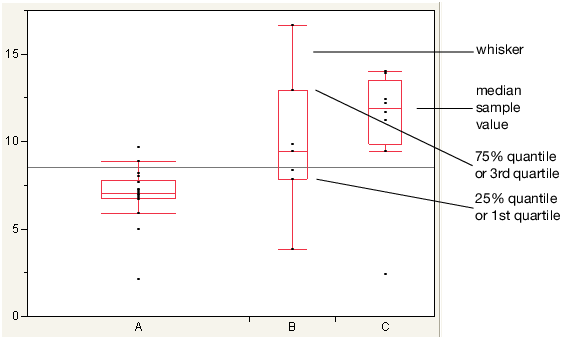
The outlier box plot is a graphical summary of the distribution of data. Note the following aspects about outlier box plots (see Figure 5.56):
|
•
|
The difference between the 1st and 3rd quartiles is called the interquartile range.
|
|
•
|
Each box has lines, sometimes called whiskers, that extend from each end. The whiskers extend from the ends of the box to the outermost data point that falls within the distances computed as follows:
|
Figure 5.56 Examples of Outlier Box Plots
